Showing posts with label graphic design. Show all posts

Tuesday, November 10, 2015

Idiot American

This is more like it: Plenty of information about the designer, Chris Bilheimer,
who has made his mark in a wide array of rock visuals in the last couple of
decades. Usually the part about graphic design is hidden away, as if the
musicians either don't want listeners to know, or want to imply that maybe
the musicians created the art too. This design not only evokes Saul Bass, but
feels like two iterations before the final art, shapes just a tad too awkward
and close together. I would have fussed with it more. But what do I know?
My apologies for submitting the tardiest music review ever.

I like "American Idiot" by Green Day.
(Wait, wasn't that, like, last century?)
OK, you know what? Let's call it a music appreciation instead. I think that's what it's called when no one really wants your opinion of the arts, or when every story has already been written about a recently deceased celebrity, but you write something anyway.

Because I'm not writing this to say you should like it too.

A hater of music reviews, I'm not about to do unto you what I wouldn't want done to me.

Music has to be the most subjective subject there is, rendering music reviews useless to me. No muscle of a writer's description is going to make me buy music, because the writer can't quite qualify why the music appeals.

It could be, and usually is, nothing to do with beat or structure or the front man's voice. It could have everything to do, and usually does, with my geographical and psychological place when I encounter the music.

Music love is an accidental thing. It is snuck upon you while you're doing other things. So it was when I first heard Copland's "Fanfare for the Common Man" in the days when if you wanted to watch TV, you had to watch what your parents wanted to watch. They wanted to watch something that showcased Copland, and after that I wanted to hear everything else he wrote.

Tom Waits sang my angst over long frustrating winter nights researching a project when I was a newspaper reporter. He always brings me back to those nights.

Caught up in The Colbert Report's final goodbye, I got caught up in "Holland 1945" by Neutral Milk Hotel (album cover art also by Chris Bilheimer), and the possible reason Stephen Colbert chose it as the last sounds we heard.

"Sweet Disposition" by The Temper Trap is a song I never would have come by, except for its use as the soundtrack for the video of a swim in which I got to take part, and the music is ingrained in me.

No music review imploring me to listen to those pieces would have succeeded.

I also understand the irony in linking these songs here, because your music tastes are scattershot, defy reason, and may even be embarrassing, like mine, and you prefer not to be spoon-fed but have the music find you accidentally. But what the heck; the link function is easy and available, so why not use it, am I right?

Our son bought American Idiot when he was in high school. He bought it electronically as a good olf-fashioned CD 11 years ago, from iTunes™® I'm sure. I bought mine 11 years later as I always have, browsing the bins at a used-records store.

I didn't know much about Green Day at the time, but trusted his exploration. I teased that Green Day was part of UBT (Unified Band Theory), my idea that all the music he was listening to came from one band, relabeled and packaged for a different audience, the only tell being the lead singer with the odd Valley-Boy-slightly-Australian pronunciation of certain words.

I'm not Green Day's audience, nowhere close. Even when I fit the demographic long ago, I wasn't into sex, drugs and rock 'n' roll. I didn't, and wouldn't, go to concerts.

And yet …

I appreciate what Green Day is saying and playing here. Call it punk-pop (here is where I betray my weakness as a music reviewer, because I don't know what I'm talking about), powerful guitar and explosive drums but with simple, infectious melody.

I appreciate the rage displayed in American Idiot, the anger and pain of suburban kids trying to get through their screwed-up world. The video made for the suite "Jesus of Suburbia,"  (NSFW I guess) doesn't feel like actors playing confused and untethered teenagers, but like real kids opening the dented door to their messed up lives.

I feel their pain, and attach the sound to my own frustrations, however different.

I appreciate the energy with which Green Day delivers its message. YouTube®™ has put me close to the concert stage I wouldn't get near in person, and I get to see the manic drive as Green Day performs, all rockstar poses, windmill arms and ridiculously wide stances and twisted faces. I couldn't tell you whether lead guitarist Billie Joe Armstrong, bassist Mike Dirnt and drummer Tre´ Cool are personas or their real selves, or some of both, but they don't hold anything back. You paid your ticket, they're going to give you a show.

American Idiot is written like a rock opera, its songs tracing a story thread of young people in the time of George W. Bush and Iraq War II and the toppling economy, all of its dislocation and anger and hopelessness and redemption and resignation.

Which may be why it's still being performed as an actual rock opera, Green Day having turned its collection into a Broadway musical (where the actors do feel like actors, play-acting as disaffected young people).

The song-story suits me at the moment. The CD rests in my car stereo, ready to blare when National Public Radio recycles a story for the third time, or sports talk radio waxes eloquent about the 3-4 defense. Or when I just want to swing the windmill arms of my mind.

It'll be there until something new accidentally comes along.

Thursday, December 18, 2014

Window shopping

Rare is my work writ quite so large or made permanent.

When it happens, I celebrate, not only the art but how it came to be.

You'll find new window signs at Greg Archer's new shop, Archer Bicycle, in Oakland, Calif.

Go there from wherever you are, bring your bike and get it fixed at really reasonable rates by one of the top mechanics in the country (no kidding!) and check out his windows. Also, play pinball, lounge on comfy chairs in the lobby — Greg's fun to hang around and cheerfully teaches you a thing or two about keeping your bike in shape.

(Shout out to FastSigns of Downtown Oakland for production and installation of the window signs! It's a plugapalooza!)

Greg and I go back quite a while. I have called him my Medici, a patron of art and my work specifically (if you deign to compare me to Michelangelo). Bottom line, he has given me a lot of projects, enjoys and encourages creativity in solving his visual communications problems, and generally lets fly with the results.

I have written about that work and our relationship many times, starting when he owned The Rest Stop, a bicycle accessories shop in Sacramento. Next, he trained to become a mechanic and opened a repair shop in the suburbs.

His Oakland store is mostly repair, but he also refurbishes donated bikes for a charity, and sells a line of Italian-made cyclo-cross-style bikes, which he reasons are ideally suited to the varied terrain of the East Bay.

His space, housing touches of streamline moderne design, is right next door to the Oakland Tribune Building, one of Oakland's skyline landmarks (though sadly the newspaper is not published there anymore).

Greg's shop is right in the heart of bike commuter traffic. Professionals professing small carbon footprints nestle in this part of town.

Archer Bicycle's new window signs play off design touches inside, turning wheels and spokes into simple sparkling overlapping shapes, diamonds and fans and circles.

The Archer logo prefigured his shop, but it fits the decor. I meant the logo, Diana the huntress on a cruiser, to feel like an old found piece of art, maybe from a long-forgotten bicycle badge, in which its possibly disquieting origin-story became lost to time.

As the shop's lone disgruntled customer — amid a bunch of glowing Yelp®™ reviews — asked, "Plus, who uses a naked woman shooting an arrow off a bike for a logo?"

Greg does, thank goodness.
Archer's original logo went
into storage once Diana
came to life.

Greg is gradually shaping the shop, which features drop lighting and a large landing upstairs that he has turned into a gallery, art@archer, featuring bike-related works.

The gallery logo has many variations, meant to stand away from the shop logo, but still connect in theme and type.

Greg keeps the shop open late for Oakland's monthly art celebration, First Friday.

As his business grows and opportunities develop for marketing and community building, Greg Archer spins off ideas and always has a project or two for me to work on.

Thank goodness.
The window schematic, barring a few production tweaks.

Thursday, August 14, 2014

Kill Fee Week, Part II


Kill fee: |kil fē| noun. Payment made to a creative for work done but not used.
Such ancient ruins, these. No chronicle of their collapse exists except for what remains of my quickly dimming memory.

The client either had no real authority to commission me, overstepped authority, worked under an assumption about her bosses that ultimately and suddenly proved false, or the project itself died. One of those.

The logos are for a food technology center that may or may not exist.

The project instructions are apparent in the lengthy explanation I supplied for each idea — especially where I chose to ignore them.

These would have been part of the step after very rough pencil sketches.

The project came at a time when I was just starting to harness Adobe Illustrator®™, but before realizing it could do more than geometric shapes. These are inspired by the work of illustrator John Hersey, an early craftsman of digital art whose work still relies heavily on polygon and perfect curves and the simplest of Illustrator™© tools.

Ironic that this project was about the wild and organic.

Thursday, July 10, 2014

Best logo ever, Rockin' Down the Highway Division

Ideal at any speed.
The road is no place for a good logo.

A logo is art most immediate. It must stab you through the heart, convince you instantly. But you have to see it first; you need the moment to consider it.

Good luck if you're also trying not to wreck on the median at 70 mph.

Naturally, most companies who depend on the road for your attention don't even try. Disqualify the Coca-Cola™®s, the McDonald's™®, all those marks that trigger your visceral "consume me!" nerve. They didn't have to rely on the highway to stab you. They've had your whole life to do that. Logos for their ilk on the sides of trucks need no extra effort to attract or repulse you.

I'm talking instead about businesses whose business are the highway, they who transport, whose products and services almost subserve the road. They don't put much design effort into a lost cause, because you can't see them and you aren't the ones buying their services, anyway.

Exceptions are few. Yellow Trucking got known by not being yellow, for example. Its trucks were the color of macaroni and cheese, a thought I thought to myself every time I saw one of its trucks. Yellow has merged with other companies and now goes by YRC Freight®©, and uses two acute triangles to form a road receding beneath its name.

May Trucking — good on a signet
ring or a shirt pocket
Geometric shapes forming roads — a go-to solution for a lot of trucking companies.

May Trucking Co.®© has a catchy monogram, but you'd have trouble placing it out of context.

Old Dominion©®'s interlocking O and D looks like a college emblem.

Knight Transportation™®'s logo begs consideration. That's the trouble: Such an intriguing logo redesign deserves a good long look — anywhere else but the madding freeway.

A knight's profile forms the negative space in a capital K. A lance appears and disappears in the mass.

What could be the reflection of his shoulder armor, or the gathering of his cloak above his armored arm — is also the stylized head of a fierce horse. It's a gem hidden at high speeds, redesigned by a firm called Summation. The old mark simply used a charging knight atop a sans serif K.

Most small-scale trucking companies are variations on airbrush Kar Kulture script — fancy but clean, but sending no more than the message, "I own this truck and I'm damn proud of it."

The along comes Oldcastle®™, a maker and seller of building supplies, an American subsidiary of an Irish company. I passed a truck bearing the logo on my farewell trip from Oregon last month, and wanted time itself to stop.

Seeing how it didn't, the logo won me over anyway, even at high speed.

It's road tested.

I first noticed the strange calligraphic "O," thick below left and above right, thin above left and below right, just as a wide pen nib and a slanted stroke would render it. But sharp and angular. I had to look closer.

Then I saw the simple but mesmerizing image of a castle tower, two cuts into the skewed rectangle and its shadow to create a battlement, a castle tower.

Then, in a moment, the lovely optical illusion: The tower casting its shadow left — solid, stately … or the tower uplit, casting its shadow onto a ceiling or forest dark to the right — dreamy, progressive?

The designer used a simple Helvetica black (or 95 neue) {thanks, Bob Dahlquist!} for the name, timeless and clean, to support the mark rather than draw the eye away.

The name is made up (nothing wrong with that), and the design has a story behind it, which is rare. The story is brief and yet oddly satisfying.

The logo, says Oldcastle® company literature, was designed by the daughter of the company founder. If it's the same person based on my Internet research (and the Internet is always correct, so I needn't worry), the designer is now a popular sex advice columnist and author in the United Kingdom.

Though formally trained in graphic design with her own London design firm, she is quoted in a news profile as saying it wasn't her "idea of fun."

I see her point. Still, being able to create such elegant design, enjoyed at any speed, I might have reconsidered for the briefest moment.

Tuesday, May 20, 2014

I love oxymoron in the springtime


Warm perfume of sycamores this time of year always makes me wistful and not a little sorry.

Their sweet-butter aroma triggers memories of madness, long hours awash in stress — and loving every hateful minute. It's a wonder I associate the sweet smell because I don't remember taking time to stop and enjoy it. I was too busy helping run the Art Directors and Artists Club annual conference showcasing the best in design.

It was a lifetime ago. My children were just learning to walk.

(ADAC's demise is a sore subject about which I've talked on and on and on. Read if you really must.)

Volunteer run, ADAC put on an annual miracle producing the conference, tricking the best in visual arts to come to our humble spaces and talk to us of their greatness.

The secret: We worked our butts off through constant collective events known as the "work party." It was the best thing ever for me, whose definition of "party" is rather parochial. Provide pizza and soda, and that's a party in my book.

In the early days, work and pizza and soda held equal balance, dozens and dozens of artists and designers all volunteering to stage ADAC events and talk about their craft as they worked and tried not to drip grease on the brilliant work of famous people.

As the club winnowed awa, teetering against the growing competition of other conferences as the nature of visual art changed, the work parties became WORK parties, emphasis on the former. Pizza all but disappeared. The work had to get done, by fewer and fewer people.

Someone less enthralled than I with the nirvana of working alongside actual designers and illustrators, pointed out the irony — nay, the stupidity! — of calling these events work parties.

While the club was beating its last, we tried to make lemonade from this oxymoronic lemon. These stencils are for a promotion calling members to yet another work party. I doubt pizza was gotten for the event. I just tried to appeal to members' visceral visual sense, to act for the commonweal.

At one point toward the end we turned the phrase into our badge of honor, with T-shirts designed by my friend Will Suckow, with the corporate sounding slogan:

Work. Party. ADAC

Memories.

Thursday, February 27, 2014

'Til it's gone

I present this design class typography assignment mostly
to pine for the day when color photocopying was a special
service at Kinko's™®, requiring one to stand in a line to
order it from a person standing behind a counter. One had to
hope that the staff beyond the counter wasn't busy producing
some family reunion memory book (comb-bound, 125 copies,
please!) and could produce your color copy within the hour.

I lucked out when I asked this to be photocopied, oh so long
ago. The counterperson could get to it right away. Fifteen
minutes later she came back with the result: The yellow was
blue, the red purple and the black a green slime.

"Is something wrong?" The counterperson had the oblivious
courage to ask. Bottom line: It was a color copy … just not
the colors I wanted.

"Anything else?" the counterperson asked. I miss those days.
Just two photocopy machines remain at my neighborhood Kinko's™®©.

Just like the good old bad days.

It's not Kinko's©™ anymore, but everyone still calls it that. No one calls it FedEx Office®™.

 "I'm going to FedEx Office™®." Who says that? You'd rightly reply, "Whaddya mean, your office! Where are you going, really?! Oh, Kinko's®©! All right."

FedEx©™ bought Kinko's™© stores 10 years ago this month, and turned them into all-in-one shipping centers and office supply boutiques and self-serve computer centers and specialty low-end/high-volume printers.

And if you're really, really patient, you can still get photocopies there.

Really, really … really patient.

The line of people last week tipped me off to the cataclysmic shift.

We stood with our documents in hand, or in manila folders under our arms, or jammed in our purses.

One of the two copiers hummed and burped, churning copy after copy for a man who appeared to be compiling some kind of family history for wide distribution. I could see pages with color photos and another with a hand-drawn family tree, piles neatly arranged on the counter opposite the copier. That's where the big paper cutter is, and at the moment nobody wants to cut paper, so he's safe.

The man churns out a certain number of copies of each page in his master document, then sets the pile on the counter, eventually to collate them.

At the other copier a couple has begun copying each piece of paper from a folder that has exceeded its utility as a folder and must rely on the potential energy of several rubber bands for structural support. The rubber bands are balled up on a little table next to the folder, now flung open like exhausted wings at rest, the papers of all sizes quivering atop a pile.

They are documents for taxes, or for the transaction of some life-altering good like a house, or medical records in a dispute over payment. The quivering pile dwindles glacially. Each time the copier lid rises and falls. Each time the couple discuss and push buttons. Each time is a discussion, each time a succession of buttons. Each paper must be copied.

So it goes. So we wait.

I do not fault them. They need copies. I need copies. They're here first. Today I can wait.

First-world problems.

The next person in line needs help pushing the buttons. I show her. She thanks me. Finally she is done and I can make my two photocopies and go.

Not a month ago, this matter would have been moot. A month ago, Kinko's™® was my Nirvana: Five photocopiers, enough even for the homeless man with his satchel of secret documents to record and still not put pressure on any of the other machines.

Five photocopiers, each capable of black-and-white and color — in one machine! A little machine next to each one; pop in your debit card, make your copies, retrieve your card, pop it into another machine that print out a receipt, and out the door you go. You don't have to talk with anyone, ask anyone for help, even though the staff at my Kinko's®™ is awfully nice.

It was perfect.

You don't know what you've got 'til it's gone, Joni Mitchell told me.

Now the usefulness of Kinko's®™ is fading, regressing to the days when I first needed the little shop on the corner. And boy, did I need it. Standing in the line last week, I reflected on how important it has been to my work for the last 25 years.

Kinko's©™® was my "Cheers," except without the greeting and beer; the closest I got from the staff was, "Back already?!" I took it as welcome, whether I was in the shop early in the morning or late at night, which I often was.

If I wasn't making multiple collated copies for my students when I taught, I was harnessing Kinko's©™ machines as art tools. Before scanning, I would make copies and carefully cut and paste (with actual glue) to create illustration effects. Or I'd run thick art paper through a special side door on the machine, to copy an illustration over which I could paint watercolor. I knew the special door, knew the sequence of buttons that would produce the copy without jamming the machines. I knew where to get the extra paper and reload the machines without staff help.

Before I had a scanner, I would use the Kinko's™® computers. Each store had one Mac™® beside the bank PCs, so I had little trouble operating them. When one store's Mac©™ was broken, I would race to the next store. I know where all the stores are in Sacramento and Placer counties, because some days I'd have to hit three just to finish one job.

A few years ago the Macs™© disappeared, and I had to learn the PC language. Then I got a scanner and didn't need Kinko's™® for that anymore. I don't use any of the many services FedEx Office™® provides, not even its shipping. And I don't need photocopies as much as I used to.

But I still need them, and my little multi-purpose printer in my office can't do the job. But now Kinko's®™ is slowly closing that down. A display rack of packing tubes and transparent tape sits where one of the missing photocopiers sat in a corner. A large-format printer spans the space that two other machines occupied. I guess what few documents spit out of that printer — blueprints for a harried general contractor, say — more than compensates the loss of photocopy customers.

It's only a short while before one photocopier remains and the line gets longer; one can break down and we'd be in that mire in no time.

I imagine FedEx Office™® will turn the single remaining photocopier into a positive, using its calculated profit-optimizing gesture to commemorate the early days, when a guy named Paul Orfalea created Kinko's™® in 1970 out of a tiny shop space near the University of California, Santa Barbara. The entrepreneurial apocrypha follows that the place was so small, Orfalea had to step outside to give a customer room to use his one photocopy machine.

I will still need photocopies. I will stand in line for the remaining photocopier, until that one is gone too.

Then I don't know what I'll do.

Thursday, February 20, 2014

A logo surfaces

This bitty one kept popping up.

Persistent. Prankish — she made as if to disappear for good, even stayed away for the longest time, until suddenly arising in another spot.

Whatcha doing? she asked, or seemed to. Can I play? Can I, huh? Huh?

I tried to ignore her. This was serious business, designing the artwork that would go on the swim caps for the 24-hour Swim Relay in San Francisco's Aquatic Park. I was swimming in it, and director Suzie Dods asked me to come up with something.

Artist at work. Do not disturb. No fun allowed.

I made lists (sometimes the same list redone in different ink and decaying penmanship), checked them thrice. What was legible became pegs on which to hook ideas.

The solution had to say, "This is the first attempt of the craziest damn swim in one of the most beautiful places on the planet!"

It all but bellowed "TIME and SPACE and NOVELTY!" like few others could.

Would I hear it?

Regardless, the solution had to be different, and swimming is a prickly client. Photography may do it justice, but graphic design often fails. Swimming is all slash of arm and splash of water and sliver of rubber-swathed head. Most it it happens out of sight.

Swim logos, as a result, often look like the ransacking of traffic safety signs: Round head, zig-zag line for an arm, two or three wavy lines for water — presto! Logo.

The swimmers in these logos by necessity display bad form — for freestyle anyway, they're almost vertical — to show the head and sometimes facial expression or features.


This event called for something different. Now, to work.

First, time: That's the marrow of this shindig, a 24-hour grind, day passing into night and back again, the feel of it. How to convey it? The movement of sun and moon, an ever-widening whirl? A watch? A Dali watch? Literally the words "24 hours?"


All of the ideas sketched, considered, set aside.

Now, place: A marvel to us outsiders, San Francisco is just as much a jewel to its swimming locals. The City must glimmer in the art.

Next, novelty: Since Herb Caen, late great columnist for the San Francisco Chronicle, called The City Baghdad by the Bay, I tried that for a bit, dipping into visual history and mythology to make visual links to the sophisticated city The City is.

Leander, swimming across the Hellespont each night to be with his lover Hero. Assyrian bas-relief, swimmers prostrate and flailing, fully clothed and behatted, as if seen from under water.

So began a spate of sketchy sketches, suggesting the rough hew of the ancient artist. Swimmers formed a circle, suggesting the passage of time and completion of laps.

Nah, I decided, too esoteric. Too far away from crazy damn swim, the unforgettable place.

I was going around in my own circles on this, getting nowhere.

Then look who showed up! The wee sea lion, wanting to play. Up she rose, I realize, from my subconscious.

The sea lion suddenly answered everything for me, time and place and novelty. It's wild, like this swim, and welcoming (not that I'd like to cross a cross one). Sea lions dwell on San Francisco's piers and roam Aquatic Park.

I saw one from afar on my swim of the park; one day I hope to see a sea lion pop up close from the green murk of the Bay, as other swimmers tell, watch it watch me, then watch it swim away.

She became the hook for this idea. I built The City around her, the water and waves and tides.

Ultimately she had come to play with the swimmers.

The water in the final art played multiple roles, surface and volume and sky and night.

I managed to fit in Coit Tower, the TransAmerica Building (a useful landmark for swimming the homeward route that weekend), the Golden Gate Bridge, the sailing ship Balclutha tied up next to Aquatic Park — even the flag buoy known well to swimmers there.

Circles became slash and splash and sun and moon. Swirls suggested a timepiece, a stopwatch, the endlessly circling crazy damned swim — I dunno, I might have enshrined a cliché on that last bit.

On the cap, the sweeping shape is meant from a distance to suggest  horns or Hermes' wings.

At least the sea lion seems bemused.

Addendum: I reacquainted with an elementary school classmate, Jim Bock, at the 24-hour swim. He's a lively member of the South End Rowing Club now, living lifelong dreams in San Francisco. When I introduced myself by social media, he sent me a copy of a chart he had made way back in 5th grade, written on pulp lined paper. It lists the class' and teacher's birthdays. Each student and teacher recorded his/her data, and Jim somehow kept that paper all this time. He and I just happened to have signed on subsequent lines:


We were adamant about adding fractions to our ages. Even then, I notice, I was playing with a logo for my name.

Wednesday, January 29, 2014

Low go

What I had hoped for …
Spoiler alert: I come out of this a pathetic whiner.

Big blue banners framed the altar at our church last weekend, to herald Catholic Schools Week. The banners bear the crest of the school, Our Lady of the Assumption, and each banner holds a word proclaiming an ideal of the school or Catholic education in general: Faith, academic excellence, service, community.

(More idealistic than ideal, really, given my experience, but there I go, whining already.)

As crests go, OLA's takes its comfortable place with all the badges and crests of just about every private parochial school ever, everywhere.

"Our Lady of the Assumption School" floats in a banner above the crest. "Hands to Serve. Hearts to Love," sits in the banner below. Eh — better than the motto of the Jesuit order — "Men for others" — which, when applied to the nearby Jesuit High School, is awkward and vaguely, unintentionally naughty.

What the school has now …
The OLA crest is divided in thirds. An image of the Virgin Mary, beautiful and demure in robes resembling a habit, inhabits the bottom of the crest. In the upper corners, a cross, and disembodied hands which appear ready to catch a disembodied heart.

I get it: Hands, heart. Still …

If it's original art, and not religious clip art or something cobbled by some faith-based apparel company, I'd be surprised. It reminds me of county emblems, in which no resource or facet can be ignored so every inch of the emblem is covered with inch-tall symbols of every resource and facet.

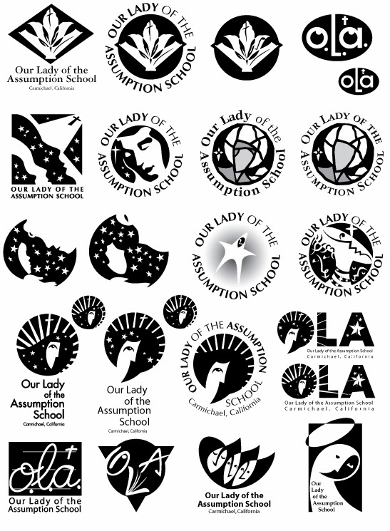
Back when our children went to the school, the principal at the time commissioned me to create a logo for the school. It didn't really have one. At best, it had "OLA" in Hobo type with an illustration of a growling cougar head for PE and sports T-shirts.

I dove into the project, not only because it finally gave me a fighting chance to be useful with my parent-volunteer hours (of which the school expected many), I was anxious to see what I could create that didn't look like every school crest ever, everywhere.

I went into full professional-designer mode, delivering an exhaustive proposal, the whole panoply.

What I enjoy in design and illustration — almost more than designing and illustrating — is researching. Assumption, as I had all but forgotten from CCD class, is the Catholic belief that Mary as Jesus' mother was taken up into heaven — assumed — soul and body. That concept formed the spine of my ideas, of Mary overseeing the school, holding the school in her heart.

Herewith, as far as my shoddy forensics skills indicate anyway, the first mark I ever put to paper for the project:
I repeated this shape for page after page, gradually spinning it into variations. You can see its skeleton in the upper corner of this first page of digital thumbnails:
Neither church nor school had any particular typeface or design uniformity, so solutions were open to a wide variety of type.

They're BBs in a boxcar, these ideas, hitting on every variation I could think of, every evocation of the church in which I grew up, and memories of school.

When I asked myself what I would be willing to wear on my sweatshirt if I had to go to this school, I came up with the image at the very top — Mary in the heavens, Mary of the heavens, radiant, looking upon the school with calm and confidence. Yet still lit from above.

I included this variation, since most people call the church and school OLA:


Then I offered the school three choices I thought worked best, based on the principal's direction.

In addition to the one above, I suggested:

its variant …
and:

Are those robes or is that a beard?

It was a gambit: I figured the simple one was so simple as to deflect meaning and life, and the one made of flowing broken lines too complicated to reproduce and too slight. The clear choice, then, would be the one I wanted the school to choose.

The Murphy's Law of illustration and graphic design posits that a client will usually pick the sacrificial turkey, the least choice, the one cleverly offered to make the other choices look better.

Time went on and I heard nothing. In fact, I learned of the principal's decision by chance, when I had come into the school office and saw the school's report to the agency that accredits the school. There on the cover of the report was this turkey:

Except without the type. It had been cut from the paper sample I turned in, enlarged on a photocopier and copied onto the cover.

"We think it's just fabulous!" said the school secretary.

It turns out the principal had no intention of establishing a logo for the school, despite the request, despite the detailed terms of my proposal. The principal just wanted a symbol for the cover of this report, something semi-official, somewhat religious in appearance, so an agency could decree the school remained in good standing.

The principal just never told me.

The current crest came to the school years after. Our children had graduated by then.

I kept telling myself I had gotten all my volunteer hours and then-some designing those logos. It's still poor salve.

I'll take some cheese with this whine.

Thursday, October 10, 2013

Halcyon days

Thumbnail for a postcard to promote one
of the many business workshops ADAC
conducted for its members. I was a wannabe
designer trapped in a copywriter's body.
Those were the days, my friend. We thought they'd never end.

Halcyon days, I called them earlier this week. Days in the Art Directors and Artists Club, long gone and irretrievable.

My first experience with this remarkable club was late one night. At least a hundred people, loud in laughter and discussion, lined the ringing shiny concrete-and-cinderblock second-floor hallway of a re-purposed elementary school near downtown Sacramento. It was ADAC headquarters, and at the time it was the 800-pound gorilla of the resurrected art center, with access to rooms on both floors.

Everyone was at work measuring and cutting great slabs of foamboard or spraying adhesive glue to the backs of artwork — sometimes accidentally to the front of artwork — or scarfing pizza. Paper and pizza boxes covered the concrete floor from end to end, the space as loud and chaotic as the floor of a stock exchange.

I was in heaven, a place of odd belonging. Someone introduced herself, handed me an X-acto®© knife and told me to start cutting foamboard.

Never mind I was barely competent to wield a knife. It was all hands on deck.

At one point I helped chair the workshops program. These are thumbnails
for a series of breakfast workshops on business issues, designed to let
designers get a little information and nosh before going into work. Yes, those
are naked butts in the bottom thumbnails: I was really pushing "Feed
your bottom line" as the workshops' name. I may actually have succeeded,
but I lack printed evidence.
Though I was a reporter-turned-copywriter at this point, a status that served me well in business amid a multitude of graphic designers, I wanted to be like all these designers who were now elbow to elbow in a feverish race to set up ADAC's big three-day design conference known as Envision.

The conference was the annual and spiritual culmination of the club, which a group of designers had begun some 20 years before with a barely sustainable big idea: Let's celebrate design. Let's talk about it, share it, elevate it. Let's see if we can cajole the best designers in the world to come here to little ol' Sacramento and inspire us to be great.

Somehow the idea grew and blossomed and worked, solely because its membership wanted it to. Fees were extremely affordable, so many joined. Volunteers did all the work on shoestring budgets, afforded from the conference fees which were also reasonable. Speakers came to the conference for airfare and a hotel room and adulation.

In the early days graphic design came out of shops — 12 maybe? 15? — each with a principal or two and a staff of junior designers, almost in apprenticeship, back when they worked with technical pens and T-squares and rubylith and photo wheels. Back when cut-and-paste meant a No. 11 blade and hot wax and a knot between the shoulderblades from constant repositioning.

Many of the principals had started ADAC, nurturing their idea with borrowed meeting spaces and slide projectors, and strung-together extension cords and guerrilla marketing. The principals sent their staffs to ADAC to inspire and be inspired.

Computers had landed on designers' desks not 10 years before I showed up at ADAC, launching the democratization — or balkanization, take your pick — of design. The good news — everybody can be a designer now! — was also the bad news. None really knew its implications, certainly not me.

I could not know I had joined the club at the crest of its great wave, and that in the succeeding years it would weaken under competition from design publications' conferences, from an ability to look inward and on screen for inspiration, and from a flat lack of members' time and money.

We had become doers without dreams.
(It reminded me of my first days as a news reporter at a small newspaper. The managing editor gathered us reporters around his desk after deadline and we talked about the craft of writing, and what inspired us. If the editor had been a drinking man, we might have had tumblers in hand. Norman Rockwell could have painted us. But soon the editor left for another job out of state and his replacement decided we didn't have time for that crap, just get to work. We didn't know until then how good we had it.)
A study for announcing how I accepted nomination as ADAC president.
Time has eliminated any explanation why I chose this bizarre way to do it.
One version is my disembodied head, vertebrae exposed, rolling down the alley.
Maybe it was a premonition.
I became ADAC president during its waning days, and at the same time one of the chairs for the annual conference, blowing out the Peter Principle by several strata. I was way out of my league and ability.

The Old Guard had left by then, and I understood. I'm old enough to have walked away from several endeavors — hell, I walked away from ADAC! — brain baked and bones tired. One or two of the club's creators would show up at events and tell me about the old days, which I had a hard time taking as advice; their presence felt more like audits. Occasionally I would hear through back channels how some of the Old Guard thought we were— I was — ruining the club, which was also hard to take.

I loved and hated every minute of helping run ADAC. I stretched and grew and got to do everything, from budgeting and planning to designing promotional pieces to bolting in floor-to-ceiling shelves for years and years of posters and archived materials. In short time ADAC lost its run of the resurrected school … first the upper floor classrooms, then one classroom on the first floor, then the closet where the archived materials were kept (I don't know if those materials still exist), then the executive director's office. ADAC became a phone number.

At one point during my presidency we entertained a takeover by a national design organization, which would have quadrupled membership prices and squeezed many of us out of our own club. We turned down the offer, but we still didn't know how to adjust to the changing market, or didn't want to.

ADAC carried on, smaller, leaner, local, lectures by some of the original members, little art shows. Sometime in the last year even that ceased except for an email address. I wonder if anyone would respond to it.

We'd live the life we choose. We'd fight and never lose, for we were young and sure to have our way.