
 |
| What I had hoped for … |
Big blue banners framed the altar at our church last weekend, to herald Catholic Schools Week. The banners bear the crest of the school, Our Lady of the Assumption, and each banner holds a word proclaiming an ideal of the school or Catholic education in general: Faith, academic excellence, service, community.
(More idealistic than ideal, really, given my experience, but there I go, whining already.)
As crests go, OLA's takes its comfortable place with all the badges and crests of just about every private parochial school ever, everywhere.
"Our Lady of the Assumption School" floats in a banner above the crest. "Hands to Serve. Hearts to Love," sits in the banner below. Eh — better than the motto of the Jesuit order — "Men for others" — which, when applied to the nearby Jesuit High School, is awkward and vaguely, unintentionally naughty.
 |
| What the school has now … |
I get it: Hands, heart. Still …
If it's original art, and not religious clip art or something cobbled by some faith-based apparel company, I'd be surprised. It reminds me of county emblems, in which no resource or facet can be ignored so every inch of the emblem is covered with inch-tall symbols of every resource and facet.
Back when our children went to the school, the principal at the time commissioned me to create a logo for the school. It didn't really have one. At best, it had "OLA" in Hobo type with an illustration of a growling cougar head for PE and sports T-shirts.
I dove into the project, not only because it finally gave me a fighting chance to be useful with my parent-volunteer hours (of which the school expected many), I was anxious to see what I could create that didn't look like every school crest ever, everywhere.
I went into full professional-designer mode, delivering an exhaustive proposal, the whole panoply.
What I enjoy in design and illustration — almost more than designing and illustrating — is researching. Assumption, as I had all but forgotten from CCD class, is the Catholic belief that Mary as Jesus' mother was taken up into heaven — assumed — soul and body. That concept formed the spine of my ideas, of Mary overseeing the school, holding the school in her heart.
Herewith, as far as my shoddy forensics skills indicate anyway, the first mark I ever put to paper for the project:


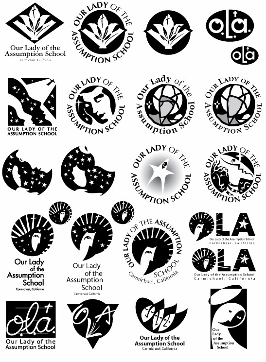
When I asked myself what I would be willing to wear on my sweatshirt if I had to go to this school, I came up with the image at the very top — Mary in the heavens, Mary of the heavens, radiant, looking upon the school with calm and confidence. Yet still lit from above.

Then I offered the school three choices I thought worked best, based on the principal's direction.
In addition to the one above, I suggested:

 |
| its variant … |
 |
| Are those robes or is that a beard? |
It was a gambit: I figured the simple one was so simple as to deflect meaning and life, and the one made of flowing broken lines too complicated to reproduce and too slight. The clear choice, then, would be the one I wanted the school to choose.
The Murphy's Law of illustration and graphic design posits that a client will usually pick the sacrificial turkey, the least choice, the one cleverly offered to make the other choices look better.
Time went on and I heard nothing. In fact, I learned of the principal's decision by chance, when I had come into the school office and saw the school's report to the agency that accredits the school. There on the cover of the report was this turkey:

"We think it's just fabulous!" said the school secretary.
It turns out the principal had no intention of establishing a logo for the school, despite the request, despite the detailed terms of my proposal. The principal just wanted a symbol for the cover of this report, something semi-official, somewhat religious in appearance, so an agency could decree the school remained in good standing.
The principal just never told me.
The current crest came to the school years after. Our children had graduated by then.
I kept telling myself I had gotten all my volunteer hours and then-some designing those logos. It's still poor salve.
I'll take some cheese with this whine.
I love the design at the top. If you want to see a turkey logo check out http://www.lagunabeachschools.org/lbusd
ReplyDelete:). i've been meaning to do one about school district logos. thanks lynn!
ReplyDelete