Ergo, I got to do this illustration.
It's for the Old Sacramento Underground tours, where I've been a guide since its inception five years ago.
This year the tour changed radically, creating consternation for the veteran guides and freaking out
the new ones.
We have learned to embrace change.
 |
| Steve Ball's design of the rack card, part of the tour's promotional campaign by Branded Sac |
The tours used to spend at least half the time telling the story of the gold rush that brought people here, but almost all of Northern California can tell that story in some way. Granted, Sacramento is an important part of that story, but new information and understanding compelled the tour program to concentrate on the strange-but-true story of its lifting.
 Enter: A quick sketch I made three years ago (left).
It's for a T-shirt concept, back when the Old Sacramento Underground program thought it was going to roll out a new shirt for the tour. It didn't.
But the concept played well for the new tour program, it turned out, and the slogan has the potential to work on several levels. The program is trying to attract younger goers.
Being the opposite of a younger person, I'm not sure whether "jacked up" still resonates as a phrase, but at least we can fall back to the literal meaning: The city has been jacked up.
Art director Steve Ball of Branded Sac, whom I've had the pleasure of knowing for many years, wanted something with an engraved look. This was my first go (left), and because I had it engraved in my mind, I went to the computer immediately:
Same building, different look. Not quite what the group was going for.
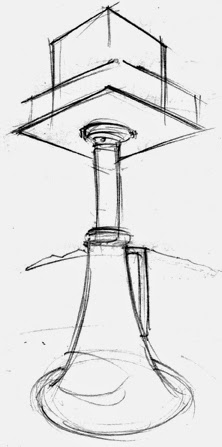
Back to the drawing board, I riffed on the original concept. I pictured a Sam Brannan mover-and-shaker type lifting up the city. But it all came down to one big jack and one tiny building.
The compelling image was the one in the middle (below), a single building rising in forced perspective over one mammoth jack.
Of course, the real buildings were raised by hundreds of jacks and dozens of men, each turning the jacks a quarter-turn in unison. Fractions of inches a day.
That sketch was refined further …
… until it got closer to final art …


No comments:
Post a Comment