

OK, just this once.
The good news: Larry Carter has a sign above his martial arts business, and the sign is professional and distinctive and invites the curious and committed members alike to his new, clean well-lighted jujitsu dojo.

The bad news: I could have done better by Larry.
The better news: I'll probably get another chance to do so.
Larry moved his dojo out of a YMCA in the Sacramento area when the Y changed direction in its program offerings. He had been running it as an adjunct service of the Y, but now runs it as a full-out business. Around the corner from the Y, in a strip mall housing a dance academy, a hair salon and a Mexican chicken restaurant, Larry set up business.
He needed a sign.
After a lot of back-and-forth, showing Larry a variety of color options, and researching what might be the most visually engaging, we came up with this:
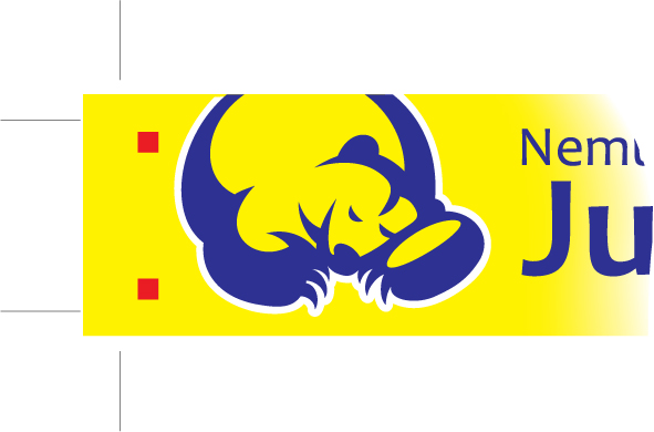
I can't claim much contribution beyond choosing the typeface (called Candara), with just a hint of serifs (the slightly widened ends of letters, such as this T) and enough swoopy wobbliness to feel warm and accessible. The bear is by another designer, unnamed, from a print shop (shoppe, as Larry, ever the Scot, spells it) and comes from the name of Larry's dojo, Nemuri Kuma, or sleeping bear.
Let sleeping bears lie, is the underlying message. A riled bear is bad news. A riled bear with jujitsu cred, moreso.
Larry had talked about redoing the logo, but I think it's an effective design which hasn't gotten enough exposure from the confines of the Y.
But the shallow sign would have made the bear hard to read. And forget about the kanji, the Japanese calligraphy for "sleeping bear." Though elegant, the kanji would have made the sign horribly busy, wasting time and space.
If we retained the business end of the bear, stated simply that this is a place for jujitsu and fitness, then the sign will have done the trick.
I built the file in Adobe Illustrator, sent it to the signmaker with whom had Larry contracted based on the signmaker's specifications, left my contact and urged he contact me with questions. Then a couple of days later, I drove by the place and saw the sign up:
 |
| Larry recently added the bear and the kanji for Nemuri Kuma near the entrance. A tasteful touch, reinforcing the visuals. Still, the sign coulda been bigger, huh? |
With it, I would have traveled back in time to do some things better for Larry's dojo.
I would have realized that time really wasn't of the essence, and we needn't have felt like we had to hurry, which made inhabit email like hermits.
In fact, we had more than enough time, and had I the common sense, I would have arranged to visit Larry on site. We would have looked at the fascia above the store and would have exclaimed, probably in eerie unison, "Wow, that's going to be a small sign for the long space above the dojo. We could go twice as big if the budget allowed."
But it didn't occur to Larry or me to wonder that; we both pictured the sign fitting the long space, without taking tape measure or time to consider certain realities.
It reminded me, just a painful bit, of the scene in This is Spinal Tap when the band's guitarist, Nigel Tufnel, rushes the order for a giant Stonehenge prop to use in Spinal Tap's big comeback, and realizes with horror that he used inch marks instead of foot marks in his order, and in place of the giant megalith the band imagined for its new rock anthem, an 18-inch model descends to the stage between the band members.
Stepping out of the Wayback Machine, I would have snapped pictures of the storefront, and would have realized then that the strip mall had been repainted since whenever it was photographed in Google Street View. Now the storefront is a reddish cream color — not really far removed from the yellow we had agreed would look best for the sign. Once installed, the sign very nearly blended into the stucco background.
And I would have insisted the signmaker show me a proof. You can see that the background behind the bear is white, and the sign I sent gives the bear a white outline, but the background is yellow. Not really a big deal, but not what Larry and I agreed to.
That brings up the biggest woulda/shoulda/coulda: True graphic designers I have known are nothing if not über-sticklers for detail. They invented the word fastidious. They are beyond passionate for the right color, but also the correct dishware, the perfect brand (of anything) and the ultimate pairing of dinner and wine. They CARE! I know a graphic designer who yanked his phone out of the wall and threw it across his boss' office because he cared that someone on the other end missed a detail.
I'm not that passionate about producing graphic design. I love it, and the discipline needs it.
Good thing I'm not a true graphic designer. My son could design circles around me, and probably will.
I'm more of a go-with-the-flow guy in life. I get along to go along, as my dad used to say, which annoyed my mom and now annoys my wife.
It's not that I don't care about creating my best craft. I drive myself crazy over the details of an illustration, making it right. I drive others crazy by over-communicating every little factoid I think others should know. I make sure that the recipients of all my files have received them, and check back again and again to see if any questions or problems crop up, and how I can solve them with the least extra cost. I assume mistakes are mine, because it is almost always true.
But I'm not passionate about the graphic design process. I keep files as simple as possible to minimize points where production breaks down. Still, barring public embarrassment, I tend to live with the results. The white behind the bear, Larry decided, was something he could live with, and that was after making the signmaker reinstate the red squares; lose a battle, but win the war.
 |
| Banner templates for Larry's dojo when it was at the Y. They're gridded out because Larry and another sensei, Greg Archer, wanted to paint them by hand. |
Larry says once business grows he'll take the opportunity to make a new sign. I hope I'm there to help. I won't need the Wayback Machine; I'll take the lessons I've learned here.
At least it sounds like there's a chance to try it again. And it's a good lesson, now you know to go visualize what you're going to make.
ReplyDeleteAnd I might be able to design circles around you but I wish I knew how to go with the flow more.
Well, we'll continue to learn from one another, huh?
ReplyDelete