
 |
| It'll be a cold day in Hell … |
I bring it up now because I'm locked in the umpteenth cage match with myself over illustration style and whether I should have one.
I don't think I have one — some who know me say I have a certain way of addressing subjects through illustration, though I'm not quite sure what that means — and after the last dust-up with myself, close as the outcome was, I stand firm:
I don't want a style.
I have always enjoyed the adventure of finding a solution through illustration, which is what illustration means to me, visual problem solving, visual storytelling (a concept reinforced through a fun mini-course I'm taking).
Problems require different solutions, stories travel different paths. So must illustration, I've decided.
 |
| Soaring boar |
The friend of a friend of friends who were getting married wanted an announcement supporting the idea that nobody could possibly believe these friends would ever marry. But they did. So, Hell froze over (Beelzebub skiing), and pigs flew, and water flowed uphill.
The newly wedded couple made a little folded booklet of these three images — no words, just a spot illustration on each panel, for which I was immensely grateful — and the final panel announced the theretofore impossible wedding.
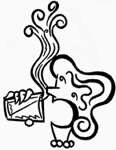 |
| Given a do-over, I would have created something different here. It doesn't fit the style of the other two. With another chance, I'd like to convey better water flowing uphill. |
So what's the problem?
Glad you asked: The problem is that so many of the big names in illustration — the illustrators other illustrators stare at and slobber over and deride in silence over our drawing tables — have distinct styles.
Some risk all by having two — two! — styles, but the biggies stick with one.
The guy I always consider in this internal debate is James Yang. Everything (OK, almost everything) is drawn the same way: Humans with flat half-moon or rounded rectangle shapes of color, squarish bumps or triangles for noses on the side of the head shape, line and circle for the nostrils, long ellipsoid eyes, simple mounded shapes for body. Primitive and immediate. Texture and patterns added; occasional suggestion of 3D or perspective, but only occasional.
Yang gets a lot of colossal work solving visual problems with the same tight menu of elements, and more power to him. My jealousy is misdirected because his success has much to do with marketing and promotion and experience and reputation and the James Yang brand.
 I could list many, many illustrators with distinct style — and a shorter list of illustrators with two styles — but you don't want that.
Nor would any fellow illustrators reading this want it, because it may reinforce the unwarranted notion that one style is sacrosanct.
My issue is really more about marketing and promotion and experience and reputation and brand; I want to turn the idea on its head, that I have no style (which many would agree) but the breadth to solve many problems in many ways.
My challenge: Build a better megaphone.
No comments:
Post a Comment