
Namely, the 24-hour Swim Relay, two editions now complete in San Francisco's Aquatic Park.
Lovely Nancy modeling her shirt, in Giants colors, of course! Client: Myself (cheeky!)
Need: A T-shirt
Challenge: Somehow capture in one image an event that defies terse description

The shirts for the event arrived in the last couple of weeks, thanks to the valiant and generous Anthony McCarley, fellow relay swimmer, who willed them into being.
(Shout out to Jeff and Red Leaf for great work making them!)
The relay registration included bright custom swim caps so swimmers could be seen and identified throughout the event. I got to design the cap's inaugural image and this year's. I imagined T-shirts for this year's event, but didn't bring it up, just presented the art. Mostly I was sensitive to the event's costs and didn't want to muck it up for Suzie Dods, the event creator and chief organizer; if shirts weren't going to fit the operational budget, I didn't want to press it.
 |
| The inaugural relay image |
My thought was that if I took the words off one version, it could be printed "backward" on one side of the cap, and the images from a distance would look like Hermes' wings on the swimmers' heads.
We were in a rush, though, and the image ended up the same on both sides.
Actually, the image on this year's caps is a detail from the artwork I envisioned for a T-shirt, which had too many moving parts to reproduce small.
After I wrote about the art and my experiences at the second relay in February, Anthony organized a shirt order.
Having gone through a 24-hour swim, I wanted this year to honor the shared experience, and became my own client in a design exercise.
 |
| Earliest known image of the 2015 design. Do others exist? Historians can only hope. And dig. |
By that time, teams had gone four, five, even six rounds of non-stop relay, with two or three more rounds before the 24-hours were up. Most people are not awake that hour of the day, let alone swimming in cold water barely distinguishable from the dark sky, the last amber lights of San Francisco twinkling and dripping and squiggling.
Swimming that early hour, I was awake in a dream I had never imagined, moving the right parts in the right way somehow, but shifting in time and space, the continent slamming up close then drifting away, seeming never to draw nearer until eventually, without warning, it did.
Driving rain — the only real storm of 2014 — and pitching water enhanced my uneasy joy.
 |
| Day and night, dark and light, victory and futility, reality and dream. |
It was a dizzy, surreal time, down being up and in becoming out, everything going and going and going, the hours stretching and flexing.
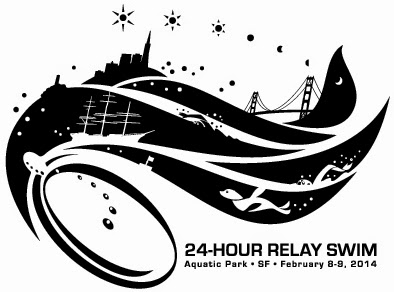
How to explain that in image? My pencil sniffed around for solutions, trying out a yin yang of water and darkness. More sketching eked out an infinity loop. Then —
A Möbius strip! A wonderful symbol for this event. I had to make one out of paper to see how it would work.
The style came immediately to mind. I envisioned a linoleum cut look, for some reason, a carved heavy real thing for an unreal thing, a writhing sea battle frozen at the moment. The final art is digital. Someday I'd like to try real linoleum cut.
 |
| This looked almost too pat, and I wanted something more organic and free. |
As the strip folded in on itself, I wanted to make the recessed and folded-under portions night, and give them heavy contrast to the raking waves of day.
Next I needed to place elements. Swimmers of course: As many as I could fit.
Cathy Harrington, on watch kayaking many hours for the swimmers that first relay, became the model for all the kayakers keeping vigil in the heavy rain.
(Though rain threatened for this year's event, it was mild and spotty compared to last February's storm.)
At one point last year one of the storied wooden row boats from the host venue South End Rowing Club was in the water in the wee hours, volunteers festooned with Christmas tree lights, watching us from within.
I put a boat in the final art and used the stern to inscribe the year and location.
 |
| Taking shape |
Of course, the flag buoy had to make it, as did the iconic symbol of the Bay, the breathtaking bridge.
Both of them went upside down, to represent the effect that night swimming had on me. To fit all the figures, I distributed parts and pieces — a foot disappearing over one horizon, an arm revealed under a fold.
I added Lisa Amorao and her head-mounted camera, to represent all those who documented our endeavor so beautifully.
Cathy got to swim the event this year; she and Lisa and I swam on the same team.
Before getting too far, I explored the same theme with an infinity loop shape, and eventually took it to full art after sketching possibilities over and over.

In the end, the original idea of a loosely triangular tableau felt more centered than the figure-eight version.
Anthony suggested offering three shirt colors to the relay swimmers, including San Francisco Giants orange with black ink (he knows his audience! Sorry, Cathy!) and arranged for all the ordering, printing and shipping.
It was quite an undertaking after the fact.
Let us just say that Anthony is beneficent and chivalrous, using this undertaking to celebrate his chance to take part in the event.
Let us also say that swimmers have asked for another round of shirt orders, which makes me smile.
 |
| Infinity loop. One problem: Each surface remains its own, never crossing. |
 |
| The shirt pocket pays tribute to Suzie Dods, who in her yellow sou'easter ran the show. |


