Showing posts with label Adobe Illustrator. Show all posts

Friday, October 30, 2015

Water color

Call it a niche hobby — designing emblems or marks for swimmers' grand endeavors.

I created one for Annabel's English Channel crossing earlier this year.

More recently I did one for Katherine's attempt of the Catalina Channel between Santa Catalina and the Southern California mainland.

The latest (left) is Lisa's, for her planned crossing of the wide Monterey Bay in the near future.

She wanted something that commemorated the process more than the achievement, and gave me a grocery list of inspirational possibilities:
  • Paddleboarder — we’re a team. I doubt I'd be distance swimming without him. 
  • I have my sights set on Monterey Bay, which, apparently is a super difficult swim. What do I know, I'm just a dreamer. I swim in Santa Cruz, I swim in Pacific Grove. Just thought it would be cool to swim from one home beach to the other. Really nothing more to it.
  • Moss Landing twin smokestack: I see them from both Lovers Point and Cowells.
    It's halfway. 
     
  • I'm a birdwatcher. It’s an unofficial sub-group within the Kelp Krawlers. We’re the ones too slow to keep up with the “A group,” they’re the fast triathletes who swim all the way to the buoy. 
Katherine's request was more open-ended, but specified
her love of garibaldis, the state fish. I tried to depict the
night-to-day nature of the long Catalina Channel swim,
and the iconic start (though the swim doesn't actually start
from Avalon or its casino) and finish near Palos Verdes.
  • We’ve been training in Monterey Bay, San Francisco Bay, and Carmel Bay: Santa Cruz to Capitola, SF to Berkeley, Berkeley to Treasure Island and back, Carmel Bay double-crossing. In addition to Alcatraz and the Golden Gate Bridge, the Berkeley clock tower. Carmelite Monastery became beloved sighting landmarks this summer. 
  • The yin and yang of breaststroking. Breaststroking as a handicap (slow, energy inefficient), breaststroking as an advantage (chop, tracking). 
  • Filipinos aren’t known in the sport of swimming. 
  • I LOVE Pelicans and cormorants. Instead of frog-kicks I’d like to think I kick more like a cormorant. 
  • Sharks. Seals. Otters. 
  • Our ocean monsters: Jellyfish...sharks... hypothermia. 
  • The Monterey Canyon
As much as I like to show my own process, I have little to show for Lisa's mark. Katherine's came quickly, starting with a representational human arm and head, and anatomically correct garibaldi. But I had done a fair streak of realistic and anatomically correct stuff, and was growing tired of it. Time to pare it to the barest shapes.

Repeating the paisley shape through water, light and eyes, I sought to bring the image together. And … done.

With Lisa's, I was stuck in the yin and yang, and didn't know whether to extricate myself or keep working with that idea. I like the yin yang symbol for its power to say so much in compactness, and like to play with the idea when given the chance.

I did the only rational thing. I left it the hell alone, letting it work itself out.

Annabel's English Channel mark
Meanwhile …

I had been playing with a marker, trying to get some illustrations done as fast as I possibly could because I didn't have a lot of time, wanted something different, and wanted to pursue saying more with less, doing less to say more.

I drew the simplest, scribbliest shapes, scanned them, then played with them in Illustrator™®, moving them in front and behind, making some shapes transparent, others solid, chopping them up, tweaking, tweaking.

It is raw and uneven and spontaneous and childlike.

It has become the new fun thing. Until the next thing comes along.

Then, while swimming, I saw my way out — by diving headlong into giant kelp.

I had been resisting kelp as an art element of Lisa's logo, even though it's really the unspoken common element in her grocery list.

I couldn't help thinking the Monterey Bay Aquarium had perfected the use of giant kelp in its logo, and ruined it for everyone else.

But the kelp's natural flowing precise elegance, its repeated pattern of bulb and frond, beckoned me. I had to use it.

The kelp became the sea in Lisa's logo, the words the sky. Originally it looked like this:

But Lisa asked that it read "One breath:"
"One breath as in one breath, that very first breath, can mean the difference between hyperventilating or being able to swim comfortably in cold water.

"One breath as in it takes just one breath to inhale cocci...


"One breath as in using the swim to breathe life into an otherwise unknown cause."
And the strawberries? They refer to that unknown cause.

Lisa is raising money for a scholarship to honor her former husband's late father, who engineered several strawberry varieties for a major berry producer in California. Lisa says she can see strawberry fields from some of her training swims.
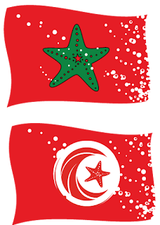
Moroccan (top) and Tunisian flags
Algerian flag
I also got to design some swim-related flags for Sakina, honoring Arab and swimming culture at once, with these versions of the Algeria, Moroccan and Tunisian flags that Sakina wants to put on swim caps.

Algerian Berber flag
Besides bubbles, the symbols became sea shapes to reflect Sakina's Southern California ocean playgrounds.


Tuesday, November 18, 2014

Pungent prophecy


This art always left me embarrassed, and I never had cause to show it — except for self-flagellation. Which I'm not above.

But events transpired last week that demonstrate quite clearly:

I'm a prophet.

Does, or does not, that ugly lump the Boy Scout is holding high aloft resemble 67P/Churyumov-Gerasimenko, the comet that the European Space Agency's little ship Philae landed on, more than 300 million miles from Earth?!

And didn't the space agency begin its amazing chase for the comet 10 years ago, when I made this art?

Case closed. I saw this coming. Eureka!

Wasn't 67P, as its friends call it, just a blip on a screen of blips back then? Could I have known its shape? No.

I'm like Roy Neary in Close Encounters of the Third Kind, raking a pile of mashed potatoes into the shape of Devil's Tower without really knowing why.

Call Spielberg. We've got a movie to shoot.
(Let me just say: If Philae never makes another peep from its shady perch on 67P, never sends another bit of data, this endeavor will still have been worth the undertaking. I hear the same chestnut popular when I was a kid and Apollo astronaunts walked and rode and golfed on the moon: Why? When we have so many problems on earth that need money and attention?

(I can't disagree about the problems. We've probably got plenty of solutions if we only willed ourselves to apply them and weren't sheep to convention and politics and fear and deference and obfuscation.

(We yearn to know, though, and I say "Go!" We want to understand the innumerable mysteries that surround us. We yearn for it so deeply that smart people figured out how to aim a rocket at a comet in fast flight millions of miles away. It sent a satellite (Rosetta, named after the stone that helped smart people decipher ancient Earth languages) which flew by Mars and specific asteroids on its way to 67P, and finally, deftly, dropped its own spaceship, Philae (named for the obelisk smart people used to help unlock the mystery of Rosetta), nestled in the satellite's womb for a decade, on to the speeding comet, where it landed with a couple of slow bumps.

(More than 300 million miles from here.
(For all those amazing accomplishments, the pity is very small that Philae's harpoons did not work and the little lander bounced from a flat sunny place to a precarious dark spot on the comet, where the sun could not recharge its batteries.

(Keep trying, I say. Keep going. We learn from Philae, and will still from Rosetta as it orbits 67P; we will learn from the next one.)
The thing in the Scout's upraised arms is not the comet, of course (or is it?) It's supposed to be a fairly realistic lump of gold, though realistically the Scout would have a hard time lifting such a lump off the ground, let alone over his head.
(Also, realistically speaking, what are those, some kind of comic book superhero Extend-O Arms®™? See, I'm good at this flogging business.)
When I was all done and applied color to all the objects, I stepped back and realized: Oh, it looks like the Scout is holding excrement. Dung. A turd. A cow patty, not unlike what one would find on the cattle ranch that played host to the Scouting event being promoted.

It doesn't look any less like feces in black-and-white, I'm afraid.

I changed out the lump for a gold ingot in the final art (or I think I did), and stamped the bar with "24 K" to stamp out any doubt.

Camporee is a sort of Scout Olympics, in which Troops and Packs within geographical regions compete in Scout skills, and build monkey bridges out of ropes and sticks, and eat s'mores, and hang out at a big campfire, and go to Sunday services if their stupid Scoutmasters really, really insist, and generally goof off.

The two Scouting districts, Pioneer and Prospector, were merging that year, and this event was a kind of mutual Welcome Wagon.


Camporee took place in the wet red earth of the foothills not far from where Gold Rush encampments filled the Sierra ravines.

Who knew we were really prefiguring a gold rush of discovery in the heavens? 

•••

In other news: The best name yet in the incessant email come-ons I receive for sex enhancement drugs: Mrs. Dolorisa Mooring enjoins me to "Make her shiver in ecstasy and desire more!" So Victorian, so illicit!

Thursday, August 14, 2014

Kill Fee Week, Part II


Kill fee: |kil fē| noun. Payment made to a creative for work done but not used.
Such ancient ruins, these. No chronicle of their collapse exists except for what remains of my quickly dimming memory.

The client either had no real authority to commission me, overstepped authority, worked under an assumption about her bosses that ultimately and suddenly proved false, or the project itself died. One of those.

The logos are for a food technology center that may or may not exist.

The project instructions are apparent in the lengthy explanation I supplied for each idea — especially where I chose to ignore them.

These would have been part of the step after very rough pencil sketches.

The project came at a time when I was just starting to harness Adobe Illustrator®™, but before realizing it could do more than geometric shapes. These are inspired by the work of illustrator John Hersey, an early craftsman of digital art whose work still relies heavily on polygon and perfect curves and the simplest of Illustrator™© tools.

Ironic that this project was about the wild and organic.

Tuesday, August 12, 2014

Kill Fee Week, Part I

Kill fee: |kil fē| noun. Payment made to a creative for work done but not used.
Stuff happens. Some projects die before their time. No harm, no foul. No fee, except for the starting payment, for services up to that point.

I learn something no matter what — in a technique, a relationship, step more skillfully taken. And I have fun.

Here's one project that didn't go to production, for a bicycle motocross racing group in Sydney, Australia, which sought a jersey redesign. Things didn't work out. Here are some of the sketches.
This is from round 2 of illustrations, in which decision makers in the club asked for
designs which hearkened to the look of other racing jerseys. I tried — but I wanted
to give the club something out of the ordinary, harnessing the print capabilities (left) and
riffing off of dazzle camouflage designs (right).
The club asked me to explore Sydney-ish visuals. The city is known the world over
for its still-stunning opera house, for example, like a nautilus disarticulating on dry land.
I played instead with the stylized image of the rainbow serpent that appears on Sydney's city coat of arms.
The rainbow serpent is integral to the myths and creation stories of
the Australian aboriginal people. As fascinated as I am by aboriginal art, especially the "x-ray" style that seems to expose creatures' bones, I'm uneasy about using it.

I feel the same about the entrancing art of the Pacific Northwest, in which native cultures have advanced an extremely spare graphic style. It demonstrates life's interconnectedness, depicting animals whose limbs and parts are made from other animals, all distinctive by their ovoid black, white and red eyes.

I'd love to draw inspired by that art, but I don't feel it's mine to mess with, that it's sacred to those cultures. Maybe I'm glad the racing club didn't choose this.

These designs are inspired by Reko Rennie, a Sydney artist known for his aboriginal-inspired geometric
forms, so simple yet so unsettling in their vibrancy. It would be an obtuse reference, but I figured the
Sydney folks would get it. Just in case, I tucked shapes of the opera house room, the Sydney Tower
and the Sydney Harbor Bridge in among the lines.
A threatened species of frog has become a sort of anti-mascot for the racing club, which rides at part of the
park where the 2000 Sydney Olympics took place. The frog's habitat limits the club's use of its track. I thought
the kids in the club might like themselves enveloped in the frog's long slimy tongue, eventually catching
one of their teammates.
The shirt would have been printed using dye sublimation, which affords subtle variations in color and detail.
I tried to take advantage of this with transparent angel flame-wings, and a gradient behind the repeated
hex nut pattern.
More frogginess
Because who doesn't love a monstrous eyeball on a racing jersey?
The project included the possibility of a logo redesign, from this:
Two-color version of the original full-color look,
featuring a frog.
To some of these possibilities:
The club benefits from a wealth of impassioned supporters, but ultimately the collective passion from many directions could not provide direction for the jersey design under the agreed-upon budget.

Tuesday, July 15, 2014

It rhymes with July

(Another baseball post. Best move along. It's only fair: I ignored your World Cup. Who won? Never mind.)

Now what?

What now?

Do I spend the next three days in grief — or relief — over the loss of baseball?

And don't say "All-Star®™ Game." We've been over that before. It's three more days without baseball. Period.

The horrid, tailspinning San Francisco Giants finished the first half of the season — really closer to two-thirds — in one microcosmic, orgasmic, spasmic show of promise Sunday.

They did something unprecedented in Major League Baseball — their starting catcher (Buster Posey) and starting pitcher (Madison Bumgarner; no sniggering over the name) hit grand slams. The broadcasters, tired of narrating long days of loss, let it all go over the air, screaming as the home runs screamed into the bleachers.

Similarly, the crowd went wild.

But the Giants also threatened to give up the huge 8-1 lead until the relief pitchers, performing against type the last month and a half, shut down the Arizona Diamondbacks 8-4 (the worst team in the division by far), ushering in the All-Star©® break.

What team will emerge on the other side of the break, after this dark time when baseball resumes Friday?

Will the Giants put it back together again? Will the starters all pitch strong through six or seven innings? Will batters whack those crucial two-out singles and doubles, robbing opponents of oxygen? Will fielders keep it all contained with brilliant plays, and relief pitchers conspire to keep foes off the bases?

You know, like the Giants did in the opening months, lovely April and May?

Or will it be this horrible June Swoon which has become a July Swoon? Will Marco Scutaro, out for much of last season and this with a bad back, return to win in the clutch, like long ago, or will his back take him out again? Will this inexplicable (though probably plain as day) collapse continue, August and September swoons of dismaying descent?

This time last year, the Giants were similarly hamstrung, so to speak, centerfielder Angel Pagan out with a hamstring injury. It was so weird for the Giants on Saturday to distribute bobble-head dolls of Pagan sliding in home for an inside-the-park game-winning home run — the same play that put him out for months.

Pagan is out again this year, bad back this time, which is usually much worse, and information about him has gone dark. No timetable for a return.

Statistics show the Giants play better and win more with Pagan. But his fragile body gives scores of tormented fans on talk radio reason to suggest the Giants move on without him.

If only the Giants had someone to trade, someone in the farm system to take his place and his lead.

Team President Larry Baer told radio interviewers last week the cavalry isn't coming. A savior is not on the way.

This is the really weird, tense, interesting, exasperating time of baseball. The Giants, still only a game out of first place behind the Los Angeles Dodgers, despite the free-fall, are one of those teams that will consider big moves to win it all this year. They will indeed search for the savior they said won't arrive.

That means sacrificing part of the team's future for something expensive and immediate from the teams that have already lost hope for the playoffs.

Meanwhile, the deep-pockets Dodgers will do the same and haul in the big finds to win the division and move on. Expect a David-vs.-Goliath showdown, exceedingly relatively speaking.

It means gambling that the payoff works this season and doesn't hurt the team too much in the next few years.

For — a trophy? More money? More butts in the seats? Our deathless devotion? I guess so.

They got mine. The race resumes Friday. What's gonna show up?

Three more days I wait.

Thursday, May 22, 2014

Your room is ready, Mr. Elephant

Different time, same old thorny issues … this illustration says three things: (1) the digital
iteration is locked away in a storage device I can't get to any more, it's so old, so this is a
photocopy of the archived issue; (2) I had Adobe®™ Illustrator©® and wasn't afraid to use
it; and (3) money makes the world go 'round …
How's everything out your way?

We here are terribly, terribly excited! Terribly! We are over the moon! — or so I'm told — because now the Sacramento Kings™® of the NBA©® can finally have its new stadium right downtown!

The Sacramento City Council™ voted 7-2 Tuesday for the $477 million stadium and financing plans to make it possible!

Key to the plan is that we as citizen/drivers need to pay more for parking downtown — and park much, much more frequently!

Sacramento's mayor, former NBA player and three-time All-star Kevin Johnson™, called the vote Sacramento's finest hour!

Now cancer will abate, everyone will have good jobs, and rain will fall precisely on our lawns and between the farm rows each early morning!

Meh.

The stadium issue has been going on for a long time. This hot mess of an illustration (above) is from 11 years ago, and the hue and cry for a new stadium was already an old and familiar sound. Since then the Kings and their arena have starred in a constant melodrama, pushed over and pulled from the brink many times, mere days away from leaving for Anaheim, then Seattle.

The specter of the arena has been moved around like a king on a chess board, inciting this and that political force to mess with the city. Now it's about three miles north of downtown in the floodplain called the Natoma District. Proponents say the stadium, called Sleep Train®™ Arena, is old and small and past its usefulness.

The proposed new stadium, which can also host concerts and ice hockey games, has been moved over the years to the abandoned railyards, slowly being gussied up … out to the state fairgrounds … and now right next to Interstate 5 and the chokepoint of the city's major freeways, where proponents say it will cause absolutely no congestion problems for games and concerts. None at all!

Past owners became villains, outside forces got caught trying to manipulate votes, the whole schmear. Most people, I'm guessing, stopped listening and caring long ago.

Now it's done. Opponent groups will block and parry once more with lawsuits and allegations — misuse of public money, hidden financial bombshells if the economy goes south — but it's done.

New Kings owner Vivek Ranadive has said the new stadium — a chrome-plated crown-shaped thing, judging from the renderings — will become a California icon, as memorable on postcards as the Hollywood sign and the Golden Gate Bridge.

It won't, of course, but Ranadive condenses the whole. Damn. Problem:

Sacramento is forever trying to be what it's not.

By forever, I mean since the Gold Rush, when Sacramento became a boom service and supply town for the mining camps, but never eclipsed San Francisco's might with its perfect port and gateway to the world.

Even after it became one of the greatest railroad cities in the world, Sacramento still served other regions' growth, and most of the Big Four (merchants Collis Huntington, Leland Stanford, Charles Crocker and Mark Hopkins) who created the great Central Pacific Railroad chose San Francisco for their ostentations.

Maybe for the heart of the 20th Century Sacramento filled its suit nicely, a place of industry and military bases and government, a walkable place with trolley cars. A big small city. I'm judging from what I read and see in books. But the bases closed and industry has shrunk.

Sacramento is, of course, the capital, the hub of government, its mainstay, but I've heard outsiders many times say, "This is the capital?" They're expecting the height of San Francisco or the breadth of Los Angeles, not Sacramento's pale copy of each.

And that's OK with me. It's never been OK with Sacramento, which is really a small Midwestern city nestled at the confluence of two Midwestern rivers out here in California. It can be a fine Midwestern city, promoting small-town ideas of caring for its own, or trying to.

But people in power and money want it to be Seattle, a truly great port city, with amazing centers of culture and entertainment that seem organic — and amazing heartbreaking problems.

Sacramento has the heartbreaking problems, of chronic crime and dearth of services, especially for its poorest communities.

The arena is supposed to solve all, and that's where the city's attention has gone for years. It'll become the keystone for its Seattle-ization. More likely, though, it'll be the same small Midwestern city, but with a chrome dome.

Once the arena is finished, the city will look around and say, "Hey, where did all these problems come from?" They were here all along; they'll still be here, exacerbated by neglect and diverted resources.

The mayor, whose platform has been the NBA®© — he was instrumental last month in representing NBA™® players for the lifetime ban on Los Angeles Clippers owner Donald Sterling for racist comments he was caught making — will likely be off to higher office by then.

Sure, it colors my view that:
  • I'm not a basketball fan, or a hockey fan or a goer to concerts or whatever else is planned. We took our kids once to a Kings game through a Scouting promotion, and calculated afterward that we could have bought the tickets, the promoted McDonalds™® Happy Meal®©, even the promotional miniature non-bouncing basketball, for much less on our own. And
  • I have no civic pride.
For 27 years of living here, I still feel like I'm passing through. Sacramento's got some things I love — a century-old bike trail along the rivers that couldn't be built in today's fierce real-estate hunger, my wonderful Lake Natoma — but the city has never entranced me.

I have never thought, "I want to go downtown," and I rarely go.

That's just me. I'm weird. It's just where I live. Sorry, Sacramento.

The stadium will replace a has-been downtown mall, which is good. It'll spark a downtown revival, I suppose, and developments are underway already to anticipate the arena's catalytic conversion.

But it's a great big want for a monied minority, and the city has great big needs — not least of which are the needs of those whom the arena will displace downtown — and serious attention must be paid.

From my perch as a permanent tourist, I'm still trying to figure out what Sacramento's trying to pull.

Terribly, terribly exciting!

Tuesday, April 29, 2014

Linked

Nothing I do ever comes whole and complete and original from my brow, of course, like Zeus, or even Seuss.
(Didja know Dr. Seuss pronounced it "Soyce," by the way? Didja?)
Everything comes tethered to memory. No less with this project for fellow facebook swimmer Inez Maurer from Down Under.
(Is "Down Under" considered pejorative to Australians, or at least tiresome, like calling California the land of fruits and nuts? [Ha ha! get it?] Then my sincere apologies.)
Could I do something fairly quick, please, for her son's bicycle motocross team as it goes to the national meet? Inez asked.

I built a couple of bicyclists in Illustrator and then created a crowd of them flowing from the center by repeating their shapes in two fans. The resulting cascade forms an "S" for Sydney.

The frog in the "D" of Sydney and the randomly placed frog eyes refer to the green and golden bell frog of southeast Australia, a vulnerable species that makes a sort of anti-mascot for the club. It's not allowed to have lights at its track, to protect the frog, so it runs all its races in the heat of day.

The yellow circles hearken to the Sydney Olympic Park logo (a yellow circle from the Olympic rings!) where the club competes. The flying clumps are negative shapes from in between the clumps of riders.

That clump comes from visceral memory, when I was a kid and bicycle motocross was just beginning. It didn't have the cool BMX call letters, nor helmets, nor organizations, nor bikes designed for the sport. It comprised our re-fashioned Huffy™® Dragsters and Schwinn©® Sting-Rays — off went the sissy bars and banana seats, on went junk-yard 10-speed bike seats — and a field where grown-ups would let us alone.

The craze must have reached our out-of-the-way town somehow, because I remember somewhere in town we could buy the number plates to fasten with wires across our handlebars, and stickers promoting motocross bikes. We liked Bultaco©® and Husqvarna™™, just for the names.

Steve and Dave Marzio, two houses down the street, drove the craze in our neighborhood. They were the builders and tinkerers. They also rode the rise of skateboards, which coincided with severe drought and high property tax burdens in California, which caused homeowners to drain their swimming pools, inadvertently turning them into skate parks. The Marzios had a pool; as far as I know, it's been empty since.

Though the skateboard craze passed me by, a whiff of W-D 40®© always brings me right back to the Marzio's workshop in the front of their garage, where I passed many afternoons seeking counsel on the gloom of junior high.

Our neighbor Buddy Butler was the envy of the street with a Yamaha bike with front shocks and maybe even suspension beneath the seat. The Marzios helped me turn a Schwinn frame with solid chrome-plated forks (I may have gotten it from Buddy) into a passable bike. In short time we went down to race in the abandoned field.

My time there was short. Grownups had shown up, grouping kids into races. I found out the hard way in the first race that my front sprocket was too big to get me anywhere on the dirt track. The crowd of elbow-to-elbow bicyclists, the one that spurred this illustration, soon passed me by. I turned my budding career to trick jumping.

My grown-up self cannot believe what my kid self used to do, especially me, hardly the adventurous type. I would speed across the vast sloping parking lot of the Catholic Church eight doors down, aiming for a low corner curb of concrete sidewalk that encircled the Catholic school building. The parking lot against the sidewalk sloped sharply to a gutter, and a blob of tar had balled up right at the base of the curb, forming a perfect ramp. Beyond the corner was one of the roads leading into church property.

With enough speed, it was possible to leap from that curb, about five feet in the air and maybe 25 feet out. That big sprocket made my bike a rocket.

I did that over and over again, often by myself, not giving much thought that it was impossible to know whether a car — unlikely as it would be on a weekday — would be coming up the road on that blind corner, or whether a kid might be coming around on the sidewalk.

What cut short that career, though,  was when I landed wrong on a jump and fell over the handlebars, draped helplessly as the bike somehow coasted across the road, into the woods and into a fence. I think I got rid of that bike. Loved those forks, though.

Hanging around Steve and Dave made me more confident, and I was able to do most of the work rebuilding yet another bike another neighbor gave me. I decided it would be the beast of the neighborhood, a beach cruiser before there were beach cruisers, a big 26-inch frame.

I stripped the frame and repainted it, brick red. I cleaned its parts (the Marzios probably directed this, because I was a dud with ball bearings and threaded pieces) and got new parts when I needed and when I could.

It was a true gem, wheels straight, slick and oiled and smooth and powerful — for one day.

The next day, riding it around the church parking lot, the bike broke in half with one hard pedal, right where the seat tube and down tube meet. The frame, having sat in a yard all those years, was rusted through and I found out too late. I walked the parts home and, for whatever reason, probably didn't ride a bike again until college.

Memories.

Tuesday, March 4, 2014

It's been a bad day

please don't take a picture!
It's been a bad day. Please!*

For a story about counteracting the Murphy's Law of restaurant management.

* REM, "Bad Day"

Tuesday, February 25, 2014

Step by step


  1. Draw a picture in pencil, in this case for a story on insurance and the result of not having enough.
  2. Photocopy it onto standard multipurpose paper, robin's egg blue.
  3. With a fine but junky brush, paint bleach where you want the blue color to … well, bleach, to create highlights.
  4. Scan the drawing into Adobe™® Illustrator.
  5. Create a high-falutin' gradient mesh to darken the blue in the upper right and lower left corners.
  6. Throw it over to Photoshop©®. Sweat the damning mystery that is Photoshop™©. Breathe. Relax.
  7. Add some yellow to the white highlights, suggesting spotlights on our upset heroine.
  8. Futz with the border.

Et voilà! A multimedia work, suitable for framing.


If ya gotta crooked frame on you.
 

Tuesday, December 3, 2013

A ghost of Christmas past

A Sanjay Patel self-portrait
Let us now praise Sanjay Patel. It's long overdue.

All you need to stop me cold is bobble a bauble of fine illustration in front of me. My Achilles' heel.

So surprising, then, I have gotten any work done at all since a couple of Christmases ago, when Santa left a copy of Patel's book, Ramayana: Divine Loophole.

It's taken this long to spout off about him because I've been busy spouting off about, well, me. And I've finally come across nice images from the book that would have been disserved by my dodgy scanning acumen.

In Ramayana, Patel latently taps into his Hindu heritage and retells a centuries-old epic good-vs.-evil tale in his vivid, magnetic illustration style.*

Patel is a supervising animator and storyboard artist for Pixar, and finds time to write and illustrate books ["The Little Book of Hindu Deities" and "The Big Poster Book of Hindu Deities" (which is really a collection of posters but I'm not quibbling)] and do such and sundry as designing exhibits for the Asian Art Museum in San Francisco.

The word you're reaching for to describe Sanjay Patel's career is cherry.

And the word for his work — for me anyway — is truly magnetic. As much as I hate online ads with my morning news and trivia gathering, I was surprised to be drawn immediately to one for the Asian Art Museum. It featured Patel's work promoting "Deities, Demons and Dudes with 'Staches: Indian Avatars." It's part of that museum's efforts to reach out in a fresh way, and wow, did it!

The color! In such combinations! So stark, so complicated! (staring, drooling)

Patel masters Adobe Illustrator™®, my medium of reluctant choice (really more of a forced marriage, but I've been at it long enough to see how someday I can learn to love it …).

Illustrator©™ allows its masters precise shape and placement to create patterns — tools which Patel puts to optimum use in the visual opulence of Hindu culture.

Precision also enables Illustrator®™ masters to pare visual communication to the smallest unit, the simplest shape, the extravagant economy of line and shape.

Patel marries the vast and the simple in his work. I'm so, so jealous.

I told him so once, and he emailed me back (little ol' me!) to aw-shucks my admiration:
"If there is anything good about my work it's from staring at other artists' creations for a really long time," he said. "Nothing original here, just rearrangement of ingredients."
Elsewhere on the Interwebs — Patel's in a lot of places, thankfully — he has said he and all his classmates at the California Institute for the Arts were obsessed with mid-20th Century illustration style, which I call "cookbook art." Should you be at or near my age, you remember the spare iconography of cookbook illustration, foods and people reduced to the flattest, sparest shape and line, artwork held together with clever use of negative space (the white paper as color), and depth and sophistication suggested with overlapping tones of a single color.

Charley Harper was a chief inspiration, said Patel. You see echoes of the mid-Century style today in the work of Bob Staake and Edwin Fotheringham, for example.

The Interwebs also show Patel's attention to detail before his illustrations reach their digital apex. Tissues and vellums (vella?) filled with fine lines and circles, weaving to shapes colored in combinations so strange to me, but combinations that work to stunning effect.

(drooling again)

See for yourself, these selections from the epic Ramayana. And find the book. Immerse yourself. I learned more than I ever have of Hindu mythology, which was inseparable for Patel culturally as a child growing up in the Southland, but has grown with him spiritually.

I learned enough to know, for instance, that the worn-out little sculptures I discovered a couple of months on the beach of the lake where I swim are of Ganesh, and that it's sometimes custom for Hindus to cast Ganesh into the water with a prayer for destroying life's obstacles.


*All these samples are by Sanjay Patel, which I obtained from multiple sources. It's all copyrighted by Patel, I'm sure, and probably by Pixar®™, and since Disney®© owns Pixar™®, and Disney™© can rain holy hell on preschools which have the unmitigated gall to paint Pluto™ (not the erstwhile planet) on their playroom walls without paying licensing fees and prostrate homage, what chance do I, a lowly blogger, have? I throw myself on the mercy of the court of public opinion.

Thursday, June 20, 2013

Most gross, man!


OK, just gonna post this, warts and all — one of my favorite attempts at digital art, but also one of my biggest disappointments.

Like the baseball book cover art, it's an homage to the art of Robert Grossman, whose work I gorged on in childhood. This was for a book of golf quotes and quips.

It features, left to right:
  • Ben Hogan, winner of nine major tournaments and one of only five to have won the four premier tournaments open to pros (I'm regurgitating Wikipedia here, having golfed exactly once — badly — in my life): the Masters, the British Open, the U.S. Open and the PGA Championship
  • Rodney Squirrel, with no golf experience that I could find
  • Lee Trevino, who won six major tournaments and twice won the British Open, U.S. Open and PGA Championship
  • Arnold Palmer, peddler of motor oil and creator of a delicious non-alcoholic drink
  • Bobby Jones, considered the greatest amateur golfer … he co-founded the Masters Tournament … he triumphed before color photography, get it?
  • Jack Nicklaus, maybe the best ever golfer, with 18 championships
  • Chi Chi Rodriguez, winner of eight tournaments, best known for his colorful quips and a toreador dance to celebrate his shots
What Grossman achieved with airbrush — the smooth sheens and blended darks and folds of fabric — I did with something called a gradient mesh tool in Adobe®© Illustrator™©.

The mesh tool is a drug, man. Addiction is certain, and I overdosed on this work. Eighty-five percent of this illustration uses the gradient mesh tool, which turns out to be a memory-hungry feature of the Illustrator program.

Therefore, it is a gremlin, creating problems that appear at the least opportune moment.

This art, for example, looked perfectly fine to me when I sent it to the art director, all the way to New York City. All the hundreds of shapes were in their place, just so.

Then the shipment of book jackets with the art arrived at my office, and I saw the gremlin's work: Notice Arnold Palmer's left shoulder, and how his lovely yellow sweater becomes transparent, showing the crest of the hill behind. Notice how his loud orange pants all but disappear above the knees, revealing the dark green knolls of the golf course and Bobby Jones' backside. Palmer's pant cuff similarly disappears.

Cover art that would appear on bookshelves everywhere.

My screams could be heard for city blocks.

I have tried over time to exorcise the gremlin from this drawing. Sometimes it works, sometimes it doesn't. Of course, when I prepped it for this blog post, the gremlin arose with new vigor.

I remain humbled.

Tuesday, March 27, 2012

Sight unseen: New work

You wouldn't see much of this work outside of this blog.

These pieces became the fallout of one of those pesky paradigm shifts.

Icons, Round 1, testing the waters …
Still, I had fun with a long laundry list of illustration projects for California ISO, which was publishing a document designed to explain to the uninitiated public and industry experts alike what Cal ISO does (which is to work ceaselessly to make sure California always gets the electricity it needs, in a sustainable way, at a fair price; you've just endured a grossly simplified explanation).

Driven by a consultant, the project was designed to arrive fully formed on the desks of decision makers, so few elements were sketched first. Most went directly to digital rendering.

The job, should I have chosen to accept (and I did!) asked:

Icons, Round 2: Decision makers needed
to see work in close-to-finished form, so
few sketches underpinned this series of work.
• Can I draw one of those twisty compact fluorescent bulbs, but twisted in the shape of the state of California, and make it glow?

• Can I make a bunch of icons representing the many electrical power sources and conveyances, such as dams for hydroelectric power, pipes for geothermal power, windmills, transmission towers?

• Can I make a bunch more icons showing power users, such as homes and buildings?

• Can I make icons showing consumer/producer, such as electric vehicles — lots and lots of vehicles?

• Can I fit all these icons into diagrams showing how power flows between consumers and producers?

• Can I make more of the same icons, but in a different way, when a tiny paradigm shift (a foreshock?) requires a change?

• Can I come up with a whole new concept for the fluorescent bulb, when that concept crumbles in the paradigm shift?

• Can I turn the western states into giant puzzle pieces suggesting their dependence on one another for power creation and distribution?

• Can I turn California into a giant conference table, around which stakeholders decide power policy together?

• Can I render a giant map of California, dotting the landscape with all the kinds and sources of electrical power?

• Can I create a single panoramic landscape, showing the spectrum and variety of electrical production and consumption?

Thoreau as art director: Simplify, simplify, simplify.
Sure! I said.

Still more and different icons …
In the end, only the last two on the list survived the paradigm shift.

The initial project itself was a shift from previous projects I have been able to do for Cal ISO. The biggest difference from the start was that it didn't require keeping to a limited official Cal ISO color palette — a dark blue, a dark green, a yellow green, an aquamarine, an ochre and a brown.

Since it's a tough — though welcome — challenge to keep illustrations lively within the palette, being able to roam around the visible light spectrum felt freeing.

Off I went:
One iteration of the state-shaped table …
… after another …
… after another …
The West became a colorful puzzle …
The design staff folded all the illustrations into the publication. The consultant presented it.

The decision makers decided: Uh, no.

That sound you heard was the paradigm shifting.

Out went all the icons and with them, the color. Another illustrator was called in to create different icons. I was asked to create a couple of new cover concepts, just in case: 

Shout out to San Diego, Los Angeles(ish), Fresno and San Francisco …
I was still filling the night sky with all those huddled masses of light when this idea got nixed.
But these didn't make the final product. Instead, the publication sampled for the cover the one illustration that remained, of the landscape of power users and consumers. You can see how that illustration gradually filled with details as its color drained away:

I measure satisfaction in my jobs by what I learn and the fun I had, and Cal ISO was gracious and patient throughout, even as the ground shifted.

This, from the first round of ideas, is still my favorite: