Wednesday, January 29, 2014

Low go

What I had hoped for …
Spoiler alert: I come out of this a pathetic whiner.

Big blue banners framed the altar at our church last weekend, to herald Catholic Schools Week. The banners bear the crest of the school, Our Lady of the Assumption, and each banner holds a word proclaiming an ideal of the school or Catholic education in general: Faith, academic excellence, service, community.

(More idealistic than ideal, really, given my experience, but there I go, whining already.)

As crests go, OLA's takes its comfortable place with all the badges and crests of just about every private parochial school ever, everywhere.

"Our Lady of the Assumption School" floats in a banner above the crest. "Hands to Serve. Hearts to Love," sits in the banner below. Eh — better than the motto of the Jesuit order — "Men for others" — which, when applied to the nearby Jesuit High School, is awkward and vaguely, unintentionally naughty.

What the school has now …
The OLA crest is divided in thirds. An image of the Virgin Mary, beautiful and demure in robes resembling a habit, inhabits the bottom of the crest. In the upper corners, a cross, and disembodied hands which appear ready to catch a disembodied heart.

I get it: Hands, heart. Still …

If it's original art, and not religious clip art or something cobbled by some faith-based apparel company, I'd be surprised. It reminds me of county emblems, in which no resource or facet can be ignored so every inch of the emblem is covered with inch-tall symbols of every resource and facet.

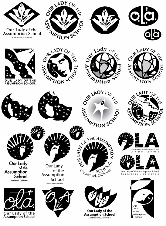
Back when our children went to the school, the principal at the time commissioned me to create a logo for the school. It didn't really have one. At best, it had "OLA" in Hobo type with an illustration of a growling cougar head for PE and sports T-shirts.

I dove into the project, not only because it finally gave me a fighting chance to be useful with my parent-volunteer hours (of which the school expected many), I was anxious to see what I could create that didn't look like every school crest ever, everywhere.

I went into full professional-designer mode, delivering an exhaustive proposal, the whole panoply.

What I enjoy in design and illustration — almost more than designing and illustrating — is researching. Assumption, as I had all but forgotten from CCD class, is the Catholic belief that Mary as Jesus' mother was taken up into heaven — assumed — soul and body. That concept formed the spine of my ideas, of Mary overseeing the school, holding the school in her heart.

Herewith, as far as my shoddy forensics skills indicate anyway, the first mark I ever put to paper for the project:
I repeated this shape for page after page, gradually spinning it into variations. You can see its skeleton in the upper corner of this first page of digital thumbnails:
Neither church nor school had any particular typeface or design uniformity, so solutions were open to a wide variety of type.

They're BBs in a boxcar, these ideas, hitting on every variation I could think of, every evocation of the church in which I grew up, and memories of school.

When I asked myself what I would be willing to wear on my sweatshirt if I had to go to this school, I came up with the image at the very top — Mary in the heavens, Mary of the heavens, radiant, looking upon the school with calm and confidence. Yet still lit from above.

I included this variation, since most people call the church and school OLA:


Then I offered the school three choices I thought worked best, based on the principal's direction.

In addition to the one above, I suggested:

its variant …
and:

Are those robes or is that a beard?

It was a gambit: I figured the simple one was so simple as to deflect meaning and life, and the one made of flowing broken lines too complicated to reproduce and too slight. The clear choice, then, would be the one I wanted the school to choose.

The Murphy's Law of illustration and graphic design posits that a client will usually pick the sacrificial turkey, the least choice, the one cleverly offered to make the other choices look better.

Time went on and I heard nothing. In fact, I learned of the principal's decision by chance, when I had come into the school office and saw the school's report to the agency that accredits the school. There on the cover of the report was this turkey:

Except without the type. It had been cut from the paper sample I turned in, enlarged on a photocopier and copied onto the cover.

"We think it's just fabulous!" said the school secretary.

It turns out the principal had no intention of establishing a logo for the school, despite the request, despite the detailed terms of my proposal. The principal just wanted a symbol for the cover of this report, something semi-official, somewhat religious in appearance, so an agency could decree the school remained in good standing.

The principal just never told me.

The current crest came to the school years after. Our children had graduated by then.

I kept telling myself I had gotten all my volunteer hours and then-some designing those logos. It's still poor salve.

I'll take some cheese with this whine.

Tuesday, January 28, 2014

Pentupmanship

Rare as Halley's comet comes a job for calligraphy, like this one.

I forget the name of the client.

(pausing for effect)

Here's what I'll say about calligraphy: It's hard.

Fun (to try and make the nib dance across the riffles and pits of the paper, to draw life from the letterforms) but hard.

Flub one flourish, come up short on an elegant stem, and you have to start over, which I did, for several pages.

For elegance and dance, you need not even leave this town to find Brenda Walton, although she's more of a paper and crafts designer anymore.

I doubt this calligraphy project of mine reached its desired use, for signage for a real estate development. To that I owe the School of Hard Knocks, finding along the way whom to work for and whom to avoid.

This particular designer was one to avoid, but I didn't know it until mid-stream. It may merit a blog post someday.

It's possible to mimic the letterforms digitally, such as with Adobe™® Illustrator©™, which I've done on occasion. One can revise and slop and refine endlessly. But it deprives the delight of seeing letterforms rendered once in a great flourish — the feelings they evoke — and the fun of making them.

Thursday, January 23, 2014

To dust you shall return


We spent Sunday picking over our own bones, just like everyone else.

By the hundreds we came, on the new dusty trail we were making along a contour of the damp barren slope, above the quiet water, like nomads afraid to stray too far from sustenance.

But it's too late. The sustaining water of Folsom Lake is disappearing.

In a good year we'd be under 40 feet of water where we walked, near the southern shore of the lake known as Brown's Ravine.

This is not a good year.

Following the driest year in recorded history, 2014 has begun with a warm unwelcome spring, the sky this morning unblemished blue, with a yellow-brown, almost glowing edge along the horizon in every direction. The sky itself, it seems, is drying up.

Folsom Lake is going, going …

Our son and his girlfriend, visiting and wanting to hike, came with us to look for the remains of a Gold Rush town again exposed by drought.

Mormon Island formed in 1848 on a sand bar near where the south and north forks of the American River joined. The town comprised members of the Mormon Battalion, discharged from their duties in helping fight for the United States against Mexico, and Mormons brought to the area by Sam Brannan to investigate this land as a possible home for the Church of Jesus Christ of Latter-day Saints.

With not a lot to do, some of the Mormon men helped John Sutter build a lumber mill in the foothills, where the guy in charge of the project, James Marshall, first found gold. Even with carpentry and providing for their families, the men still had a lot of leisure time and spent it looking for more gold.

Mormon Island began as the site of the greatest placer (surface) mining find of the Gold Rush. Heavy gold sparkled from the riverbed, easy pickings. Sam Brannan became rich beyond reason by telling the world about it. Maybe the world wanted to believe that all the gold in California was so easily found. Whatever the reason, tens of thousands came, from every state in the union and every liveable part of the world, as I say on the Underground Sacramento tour.

When the world arrived, sick and gaunt but still lusting for gold — even when it realized getting any would require hard work — Brannan had all the necessary tools ready for sale, at the exorbitant prices the market would bear.

Brannan was also asking finder's fees from the Mormons of Mormon Island making claims on the gold finds, which have been reported erroneously as Brannan exacting tithes from the faithful and keeping them for himself. When the military governor of California told the Mormons Brannan had every right to ask the fees — as long as they were fool enough to pay them — the fees dried up.

Mormon Island, the town, burned up, as Gold Rush towns tended to do. It had a brief glorious existence — from 1848 to 1856 — including four hotels, three dry-goods stores (including one of Brannan's), five general stores, and a Pony Express station. It boasted of having hosted the first grand ball in Sacramento County, and a population of 2,500.

A few people still lived in the town limits until the mid-20th Century, but in 1955 Folsom Dam was built and the three forks of the American River stoppered into a sprawling lake for recreation, flood control, electrical power, urban consumption — all those marks of progress.

The bodies of the town's pioneers were moved to a cemetery high and dry. What little was left of their town disappeared under the dark green water for decades. Its outskirts have peeked out a few times since during drought.

Even with Folsom Lake at its lowest level yet, the center of the old town is still under about 90 feet of the water.

What visitors see now is the periphery, the uncertain edges of the town. So much might-have-been and could-be's. No one seems sure what they're looking at, as the rubble of foundations rise from the wet earth.

More people than would have shown up with their fishing/wakeboarding/party boats on a searing July day have made the pilgrimage to Brown's Ravine this winter Sunday of a three-day weekend. What the Parks and Recreation Department may have lost in boat haulage fees, it's making up in vehicle day passes.

"Go all the way to the end," said the cashier in the ranger kiosk guarding the entrance. She knew where we were going. Down a windy road, past scores of sailboats hauled out of the water months before and imprisoned in their own special parking lots. They'd bob in a marina normally.

The shopping-center sized parking lot, where boaters park after putting in, was filling with cars. Already we could see the dust clouds where clots of people roamed the same dusty trail over the next rise, where the lake had been.

We joined the caravan, the carnival, the strange spring frolic. Part of me felt like we had heard about the little child who fell down the dry well, and had come in our lusty curiosity to witness the anguish. Part of me felt like we were the kid down the well, waiting out the end. Just a couple of vendors and the funereal feel would have made it complete.

Groups of people took selfies and group photos amid the laid-stone foundations, cheery in their collective unknowing doom.

The state parks department has set plastic sandwich-board signs next to each conglomeration of artifacts, each discernible foundation of some building or another. The signs admonish visitors not to deface or take the artifacts, important as they are to the archaeological history of the place.

Were I the dad with the little kids, I would have been the one saying "Don't touch!" too many times. Most parents let their kids pick up all the rusted bolts and nails and discs of glass that someone has carefully set on every tree stump and wide piece of rock.

And what the hell? Why not? The artifacts aren't that particularly important. They may have come from last century; they may have come from last winter. No one knows, no one cares, except that they may be old.

They remind me of the old cars we kids came upon about a mile into the woods across the street from my childhood home. Maybe they were 15 years old, maybe 50. Bullet holes decorated each. Naturally we just knew a bloody gangster battle had taken place here, in what would have been a remote corner of Santa Barbara County. It made no sense, yet it made every bit of sense to us.

So it is with the tree-stump displays. Attach your own idea what they are, where they came from, who held them. No one's going to refute you; no one cares. Not even the parks people, even though their signs say otherwise.

As soon as possible, everyone wants these mysteries to disappear again under green opaque water. What's left of the lake seems like a live thing dying, thick and smooth like a sheen of oil. A boy navigated the muddy banks to throw a handful of pebbles across its surface, as if to awaken it.

Who knows how long the water will last, and what happens when it's gone?

I dream of the water rising again, so gently as to leave the nails and bolts and handles and glass bottle bottoms right where someone set them on their gray tree stumps.

Tuesday, January 21, 2014

Where are we?


The least awkward of my Martin Luther King Day cartoons: That's the best I can say for this one.

Lacking authority, experiences and nuance, yet desiring each opportunity to have something to say on the day commemorating Martin Luther King Jr.'s birthday, I closed my eyes and swung.

This one comes to mind in light of news that Fallujah, the Iraqi city for which U.S. and contract military fought the bloodiest and costliest battles to wrest it from Iraqi insurgents during the second Iraq war, has fallen to militants linked to al-Quaeda. Internal warfare and violence in Iraq continue to worsen. News stories in the last month have quoted many U.S. warriors who question the purpose of that battle and of the war to which they were sent.

As should we all.

This 'toon talks of my view — support for which can be debated hotly — that the military comprises a disproportionate of people deprived of many other opportunities. People who are not as fortunate as me. (Also, people who saw their duty, and deserve my respect, where I saw a war waged for still-questionable purpose.)

Infantry, I learned with a chill recently, derives from a Latin word for "babe in arms," meaning young, inexperienced foot soldiers sent into the first blows of battle before officers and heavy armor join.
We must see that peace represents a sweeter music, a cosmic melody that is far superior to the discords of war.  — Martin Luther King Jr., Nobel Prize address
On a sweeter note, our son commemorates the day with music. Enjoy

Thursday, January 16, 2014

In the beginning


Pick a play, pick an art movement. Marry the two in the design of a theater poster.

That was Jan Conroy's assignment. He might as well have given me the keys to heaven. I suddenly felt I was doing what I was meant to do.

It was a roundabout way of getting there, but no matter. I had gone to school to become a news reporter, became one, and didn't want to be one, long story short.

I wanted to get into graphic design and illustration instead. Though I had gone to a school renowned for graphic design, I was told I couldn't major in that and journalism (my mistake for not challenging that ridiculous assertion).

My mercenary co-worker having sufficiently convinced me of his threat to kick my ass if I didn't pursue other career options beyond our newspaper job, I signed up for the graphic design certificate program at the extension program at the University of California, Davis.

At the same time, I had joined the Art Directors and Artists Club in Sacramento, where I soon found artists and designers and writers full of contagious energy and idealism. My world was shifting.

Yep, the extension program was glorified night school, for something far less than a degree. I didn't care. I had found my playground.

And Jan Conroy, an art director at UC Davis and a gleeful graphic design historian, had the courses with all the cool toys.

This is one of the assignments from his graphic communications class. I chose German Expressionism to illuminate Shirley Jackson's The Lottery, a play based on a short story I knew well as a junior high thespian.

(I was old man Warner, with baby powder in my hair and a wheezy voice, and Brad Nemchick played him every other day, and we tried to get each other to say "chewed stickweed" instead of "stewed chickweed" and cause the play to implode in gales of laughter. Don't tell me we junior high thespians didn't know a good time.)

The rough, shouting, impulsive Expressionism seemed to fit the American Gothic play, about a small remote farming village that ensured a good harvest by stoning one of its inhabitants to death. The sacrifice was chosen by lottery ("Lottery in June, corn be heavy soon," as a character says), by a slip of paper with a black spot on it.

The paper became the heavy sun in my design. The ancient ritual of killings that ushered the harvest became the root ball and nutrients for the next crop.

It was done in scratchboard, a new medium for me, a fine and pleasant medium that made me feel part of the work, the creamy and satisfying scratches, lifting the thin layer of black ink off the fine white clay surface.

I wanted the finished work to scream and vibrate, to alert playgoers to the macabre hayride as villagers bargained and argued and ultimately succumbed to executing one of their own for the sake of their reaping.

PCPA Theaterfest is a real thing, by the way, excellent live theater in Santa Maria and Solvang near the Central Coast.

I'd go to see that play.

Tuesday, January 14, 2014

Resolute

At twilight on one of the busiest, bicyclist-unfriendliest roads in our neighborhood the other day, this tableau of determination emerged from the darkness and the dizzying strobe of headlights and tail lights.

First I thought, "How?" How is this caravan rolling? How does man pull the trailer, pull woman in wheelchair? How does it not come apart in a great tragedy of metal and bone and blood and tarp under the juggernaut of rush-hour traffic? How do they keep from catching one of their many wheels on a rock or lip of tarmac and disappear into a ditch? How do they keep going?

Then I thought, "How?" How did they get here? How did woman get in a wheelchair? How did their belongings become this caravan? How do they keep going? Where do they go?

I've seen the couple on a corner of the same busy, angsty street. The man holds a cardboard sign written so wanly it's illegible. The woman sometimes waves. Their conveyances must be stowed behind the sign for the drug and grocery store there.

I never have money to give. I never feel comfortable giving at intersections, not that I wouldn't if I could, but the timing, the causing of people to approach my car while the light may change and the traffic may move and other drivers might not see the exchange and put the people in peril.

I could pull over and give money if I had it. I could go buy a meal and deliver it, assuming that's what they wanted. But I don't. I always have somewhere to go.

I'm nothing if not armed with reasons and defenses.

Do I open my home? Do I act my faith? Do I endanger by doing so? I'm moved and stuck and struck.

The image of the caravan has etched in me.

Don't laugh: I can't help but think of an episode of M*A*S*H, made to look like a TV news special, filmed in black-and-white, in which an actual news reporter, Clete Roberts, asks personnel about their experiences in Korea.

The writers drew on a real moment from the war when the reporter asked Fr. Francis Mulcahy if his time in Korea has changed him.

"When it's cold here, like it is today, and the doctors are operating, they will make an incision and the steam rises from the open wound," Mulcahy answers. "And the surgeon will warm his hands over the steam of the open wound. How could anyone look upon that and not be changed?"

Thursday, January 9, 2014

Getting the weirdness over with

Be careful what you wish for.

I sure got it, asking a publisher if I could experiment with the next illustration.

What emerged was the weirdest illustration I ever attempted, and the single largest trading day for the X-Acto®©™ company.

I had been inspired by an illustrator who showed his work at one of the Art Directors and Artists Club's annual Envision conferences in Sacramento, where I once posed as president.

I think the illustrator's name is Eddie Guy, can't be certain. I remember he did one distinct illustration style under another name and persona, and this cut-and-paste style under his own name and real persona. Or vice versa. I can't remember. I don't know if he still does this.

It was interesting and aggravating to meet someone getting work as two distinct people, when I was struggling with my single milquetoast personality.

I riffed off the illustrator's style to illuminate a story for Brew Your Own Magazine about the pleasures and pitfalls of providing entertainment with your meals and brews.
Step 1: Go to the library, buy an armload of magazines, 25 cents apiece. Fashion magazines — Vogue, Mademoiselle — held the greatest potential, or so I thought.

Step 2: Clothespin my nose so I can browse the magazines with minimum aerosol poisoning from the perfume ads.

Step 3: Buy X-Acto®© blades. Lots and lots of X-Acto™© blades.

Step 4: Forsake all else save the numbing turn of pages as you search for something you don't know you're looking for.

Step 5: Cut out hundreds of precise shapes in the wild hope they'll come in handy.

Step 6: Store them somehow in a manila envelope.

Step 7: Try to sort them, but give up in disheartening futility. Cram the cut shapes into the envelope, hoping you find them again.

Step 8: Do not sneeze.

Step 9: Buy glue sticks. Lots and lots of glue sticks.

Step 10: Glue the exact shapes you need to your elbows, where you won't find them until you go to wash your hands and accidentally see them in the mirror.

Step 11: Get smudgy, gluey fingerprints all over everything. It can't be helped.

Step 12: Despair that this is how you'll spend the rest of your life, and that you will be found comatose in a cascade of tiny cut-out eyeballs and hands.

Step 13: Somehow, some way, finish, resolving never to do it again.
Thirteen steps seems about right.

I had the basic sketch worked out, even the goofy BrĂ¼ Oyster Cult name for this fictitious joint. Everything else depended on whether I could find what I was looking for — and how willing I was to shift on the fly.

Lots and lots of shifting on the fly.

After following all the steps religiously, and looping through steps 5 through 8 a couple of times, I managed what you see here. Completely. Bizarre.

I had trouble finding the pearlescent texture for my oyster. I think the result came from my wife's scrapbooking papers.

The entertainer's face is Bruce Willis', I think. I gave him two left hands on the fretboard. I was high on glue stick fumes by this time.

The proprietor's face is Nancy Reagan, and attached to the black-and-white lower jaw it came out looking like Alan Alda. The hand holding the gentleman's cigar is Bill Cosby's. The superstructure holding the sign is a bridge arch.

The original art is probably still glued to the back of something else, lost forever.

I don't know how this Eddie Guy did this and still stayed sane. It looks like he still does a variation, and I hope he does it digitally.

When I attempted a similar style recently, it was so much easier to find patterns and images online, and re-purpose them to a new image. I have probably violated copyright protections that haven't even been conjured yet. Here's how I begat Huell Howser, for example (above).

I don't even know where my X-Acto®™ knife is anymore.